Friday, December 19, 2008

what is sport? - roland barthes

(Translated by Richard Howard, published by Yale University Press, 2007)

This little book is a gem. It is originally a script Barthes prepared for a Canadian documentary. The French philosopher (I can say that here without groaning) explores the role of five national sports including the Tour De France and Spanish bull-fighting. What pearls of wisdom does he have to offer? Several, and also a writing style in translation that is lovely to recite.

A man alone, with no other weapon than a slender beribboned hook, will tease the bull: call out to him... stab him lightly... insouciantly slip away.

But Barthes is not blind to Spain's obsession. He comprehends the significance of the bull's death and places this archaic ritual as a tragedy in four acts. I shan't spoil the fun by telling more since Barthes' short piece of narration will occupy your eyes for only a few minutes. Still, it has the potential to occupy your thoughts for some time to come.
...the Tour is incorporated into the depths of France; in it each Frenchman discovers his own houses and monuments, his provincial present and his ancient past. It has been said that the Frenchman is not much of a geographer: his geography is not that of books, it is that of the Tour; each year, by means of the Tour, he knows the length of his coasts and the height of his mountains...

There is no doubt that sport dictates the ebb and flow of Melbourne. Does a Melbournian measure train trips according to the number of stops before or after Richmond and the MCG? Time according to the number of days before or after the Grand Final? (Or on a shorter scale, before or after half-time?) Can weather be associated with cricket, tennis or football seasons?

Anecdotally (and I suspect supported by statistics that I admit I have not recently consulted), the waves and surges of fans and participants that enter our cricket grounds, football ovals, tennis courts, velodromes, athletic tracks, swimming pools, gymnasia, hockey pitches and even our lawn bowls greens, far outweigh the streams that attend or present at art galleries and live performances.

Melbourne prides itself on being a "cultural capital". Do the bean-counters still employ the trick of including sporting events as a cultural activity? Is riding down Beach Rd. in a 100 strong bunch of lycra-glad, carbon and Campagnolo wielding men cultural? Or sub-cultural? ;-) Given the chance, on a balmy summer's evening, I'm a sucker for the buzz of freewheels or the grumble of boards under a sprinting bunch. All the better if my freewheel buzz or my wheels' thunder adds to the melee. Hopefully I can participate with style.

Style? Here Barthes again has a lovely way with words.

Style makes a difficult action into a graceful gesture, introduces rhythm into fatality. Style is to be courageous without disorder, to give necessity the appearance of freedom.

So what is Sport? Sublime. Sublime in the way a practiced artist wields a brush, a baton, breathes life into a flute or a character. Sublime also in the way a sculptor forms a marvel from a mass. Life's confusion can be executed with style only by a few. An athlete approaches this ideal as closely as an artist since each pushes the bounds of the possible. The latter pushes the possible for the future. The former, perhaps only for the present.

Thursday, October 23, 2008

tindale's map of australian aboriginal tribal boundaries

Tindale's map of the boundaries of the tribal lands of Australia's aboriginal inhabitants is currently appearing on television sets across Australia as part of an advertisement for SBS's documentary, First Australians. The narrator for the advertisement announces that the early settlers arrived here to inhabit a land declared terra nullius... an empty land, belonging to nobody. Tindale's detailed map is convincing evidence of the arrogance and ignorance of the claim. The map lends weight, at least to my Western eyes, to the existence of a people and culture that occupied the space we are now claiming as ours. I knew and acknowledged this previously. But the map brings it home with alarming force. How could it be possible to go through an entire Australian school education "knowing" this fact without really understanding it? What I have seen of SBS's documentary so far is stunning. This would be great to show Australian school kids! I wish I could have seen it years ago.

It is more than a little discomforting to consider that "my" city and the house on the tiny suburban block of land where I live, have all been taken forcibly from people who belong here. What's worse is that in many cases these people weren't simply displaced, they were killed.

Just down the road from me is, by Melbourne's settler standards, an old cemetery. The oldest graves there are from the 1850s. Settlers living 10 or 15 kilometres from the central city set up orchards and market gardens in the hills now called Burwood. Their families are buried, looking away from the city towards the Dandenong Ranges. Some of the old weatherboard houses still remain. The oldest I've found has sat above the cemetery since 1905. The spaces between it and the graves have been subdivided and filled with rows of brick and timber houses and units. All of this suburban development is on land that was in the range of the Wurundjeri. I wonder, when was the last time an aboriginal family stood on the hill, looking towards the ranges? When was the last time an aboriginal family left their own dead in the region?

Thankfully the First Australians is not all glum. It includes fantastic archival film footage, spectacular photographs, fascinating readings from journals and field notes, interviews with historians and, thankfully, interviews with people who know a good deal more about native culture than the recent visitors. Terrific!

Friday, October 17, 2008

creative bike parking III

By the third episode of a TV series things have settled into a routine and something special is needed to keep things moving along. By the third in a series of feature length movies only a miracle or an obsessive fan base will keep the numbers rolling in. The third blog post on a topic? Well, I think probably only the author is going to care... unless there's something really special to share. And this is it. Yes, its the ultimate jukebox-inspired, robot controlled, multi-storey, swipe-card operated, architectural marvel... a bicycle parking contraption. This is the stuff of Wallace and Gromit's basement laboratory. In fact, its just thing I need in the basement. I will never snag my pyjama cuffs on a pedal as I stumble around in the pre-ride darkness again! A simple swipe and within 23 seconds today's bicycle is waiting. Now where did I put that darn swipe card? What was the bay number for the yellow racing machine again? 23? Or is that the old ten-speed? :-(

Thursday, October 16, 2008

carbon ecologies - richard thomas

On the second floor of the Carlton Hotel in the Melbourne CBD (2nd flr, 193 Bourke St.) are a handful of ex-hotel rooms (with cutely numbered doors) that are housing Richard Thomas' exhibition Carbon Ecologies for the next couple of days. On the floor below, hundreds of men and women in smart office attire sipped their after-work beer as the artist's friends, acquaintances and family members packed themselves into the tiny rooms to enjoy a series of international works, the first of which was created in 1998, well before Carbon was a trendy dinner party conversation topic in Hawthorn, Toorak and Canberra.

There's something much more raw about attending an exhibition in a cramped and tired suite of rooms above a bustling hotel than in visiting (for instance) a glossy, glitzy showcase of Art-Deco at the NGV. In Thomas' case, and especially for the work he was exhibiting, the venue was (almost) perfect. What I've seen of his work is down-to-earth and deliberately rough-hewn. It would have been disconcerting, perhaps even hypocritical, to see these works arrayed across a glistening, echoic and expansive gallery. Or would it? The artist might have been pleased with an NGV blockbuster.

The two works at the exhibition that most attracted my attention were Brown Out (2008), "a simulated coal face, using brown coal from the Mattingley coal mine near Bacchus Marsh. Brown coal is being burnt in real time to generate the electricity which lights the installation." and Carbon Cycle 2 (1999) which was realised as part of the Natural Disasters exhibition at Monash University Museum of Art (Curated by Zara Stanhope). Three metal trays presented the three primary materials providing energy and transforming terrestrial carbon into carbon dioxide, these being coal, oil and wood carbon."

Why did these works attract my attention in particular? Carbon Cycle 2 is a beautiful installation in all ways. I am strongly in favour of beauty in art! Firstly the viewer is struck by the textural qualities of the materials. The matte black irregularity of the coal and the slick mirrored surface of the oil make this a fascinating aesthetic object. At least one woman reached down to touch the oil, attempting to reconcile the shiny hard surface with her understanding that it was in fact liquid. These boxes of unfathomably dense black are also difficult to reconcile with the invisible gaseous CO2 that is emitted when they are oxidised. It seems absurd that their solidity can depart in this way. I suppose Carbon is not unlike the soul of these materials. As they are exhumed and cremated the soul is left to wander about the atmosphere causing strife. The work is sublime in the way that Malevich's Black Square or a Rothko is sublime. I would have appreciated a chair beside the work so that I could sit and gaze into the inky darkness. If people were so inclined perhaps they could also sit and contemplate their own reflection in the slick oil - Narcissus sees himself reflected in the oil he burns.

Brown Out is a fantastic surprise. "Down the corridor and on the left" ...directions you'd be given at any hotel to find your room. But step inside and your feet are nearly buried in a mass of steeply sloping coal dotted with blackened bulbs. Never one to shun hard work, I expect Thomas carted all this coal up two steep flights of CBD stairs, slaved away in a tiny, dusty room (no doubt for many hours) in order to confront the visitor with such a spectacle. Considering the show is on for a mere three days I find this even more marvellous!

Indeed, we were burning the coal fires as we chatted under the installed lighting. Thankfully though even this was taken into account. The emissions of the exhibition are offset through his own company, treecreds.com. I am so glad I caught public transport to the opening!

Monday, October 13, 2008

wall-e

Wall-E gets my thumbs up. I couldn't help myself. The story was so predictable, the moral so overt and the characters so typically Disney, but it was great.

The Earth has been buried under mountains of rubbish and the Human race has departed for life on a giant cruise (space) ship where their every need is catered for by a squadron of handy robots. All inter-human interactions occur on-screens from the comfort of mobile, levitating deck chairs. People have (d)evolved into jelly blobs. Meanwhile, back on Earth, a sole cleaning robot, Wall-E, remains diligently collecting and organising the rubbish. He gets immense pleasure from watching an old video of Hello Dolly he has found in the rubbish... and then along comes a surprise.

The animation is great, the rendering super, the dialogue minimal. The sound effects are distinctly Apple-flavoured. The film is closer to traditional character animation than the usual Hollywood dross. I rate it 4 stars David. Me too Margaret.

Monday, October 6, 2008

art dec-adence

The (now closed) Art Deco blockbuster at the NGV was a gallery-sponsor's dream. Plenty of photo-opportunities, advertising quality (and advertising) imagery, spectacularly sleek cars, elegant dresses, striking accessories, exotic furniture and household goods. Everything was designed to within an inch of its life utilising the best in brushed or polished steel, gloss black enamel and the finest shagreen. The NGV was the house of style. Had it been a shopping centre for homewares I may have been tempted to buy one or two of everything. A wander certainly topped even a trip to the local Ikea megastore, social-democratic, utilitarian designed, pine extravaganza. Thankfully visitors were spared the Swedish names (Does anybody outside of Scandinavia want to sit on a couch called Ektorp Jennylund?) and I suspect none of the goods was flat-packed (apart maybe from the glass and chrome Strand Palace Hotel foyer).

Its great to see the attention lavished at the time on linking materials and form, especially for mass-produced household goods. Bold colours, material contrasts and strong geometry are a welcome change to the current soft, fuzzy friendliness of much of today's design. Of course these were times when no heed was paid to environmental impact. Decadence was the style of the day (for those who could afford it and for some who couldn't). I hope we don't rebel against the current green trend and head this way again, but I still enjoy looking back at the glory that was. The greenest thing in the show was the jade AWA radio.

Wednesday, October 1, 2008

aboriginal rock painting: ships, aeroplanes and... bicycles!?

Djulirri in north-western Arnhem Land is home to the most expansive and spectacular discovery of Aboriginal rock art spanning ancient and modern humanity - Sydney Morning Herald, 20 Sept 08.

This is the most exciting news I have heard in a long time! According to the article in the SMH and the fabulous video there are images of ships (both outside and inside), aeroplanes and even bicycles! Obviously I am very interested in the bicycles... when would people up that way have seen bikes? Who would have been riding them? Perhaps it was the missionaries.

Bicycles aside, I think this is a marvellous find for Australian history. The drawings of the ships are extremely detailed and so well performed it is easy to identify the subjects. Sails and rigging, deck layouts and portholes... all are depicted clearly. What a bizarre and incredible outlook these drawings document: from kangaroo to biplane. Is there another archaeological site anywhere in the world that has been a living document of a history for so many thousands of years?

The fact that the ship drawings include internal detail is particularly telling. I wonder if the Aboriginal artists had seen drawings made by the visitors prior to setting these images on the walls. Would the Chinese or European style have influenced their own depictions of the world? Perhaps these images might provide evidence of this. Is there any evidence in China of the interactions with the Aborigines of Australia? Can anything in this find somehow be linked with the map drawn by Mo Yi Tong in 1763? (This map was apparently copied from a map made in 1418... see image below from The Age, 16 Jan 06.)

Early visitors to our shores may have been a little less destructive than the later invaders and missionaries in order to trade for sea cucumbers! Very strange. I hope they could be preserved for the journey back to China. Anyway, there is a huge part of history waiting to be coloured in. Not the least of which is... what kind of bicycle did the artists draw and did they draw the frame and handle-bars correctly? Non-cyclists are notoriously bad bicycle drawers!

P.S. Thanks to RealDirt for the heads-up on this one.

Tuesday, September 30, 2008

complexity increase in evolutionary software

Daniel W. McShea, Perspective: Metazoan Complexity and Evolution: Is There a Trend?, Evolution, Vol. 50, No. 2 (Apr., 1996), pp. 477-492.

[Image credit: Fig 1. Increasing complexity in evolution? McShea, 1996]

It would appear at a glance that evolution has driven increases in complexity from replicating molecules up to conscious humans. Is this justified? Or are humans simply so self-centered that we line everything up behind us, even in this modern day and age? A-Life has held the production of open-ended evolution in-silico as one of its aims for some time. Early models such as Ray's Tierra or Yaeger's PolyWorld are two of my favourite approaches to the problem. Each of these software ecosystems has spawned a complete lineage of programs addressing similar concerns. McShea's paper looks at data on real organisms and attempts to discern any trends in their evolution that would justify the belief that organisms evolve towards greater complexity. Consequently, it addresses an issue of real importance to A-Life that harks back to the formative years of Tierra and PolyWorld.

McShea's approach is firstly to clarify the kinds of complexity that can possibly be measured in real organisms. This has long been a sticking point... the real world is not always so easy to divvy up as information theoreticians might like. Useful, information-theoretic measures of organism complexity are difficult to specify. McShea simplifies matters a little by trying to count organism parts and internal processes that are specific to some groups of Metazoan. I won't go into detail here. His conclusions is interesting: we still don't know enough to say either way. He proposes an "emphatic agnosticism". This is a far cry from the usual assumption we make about complexity increase. There is room here for debate. Anyway, leaving that aside also since it still isn't the main point I want to raise in this post...

If, for some obscure reason, biological evolution turns out to be closed, could we modify the scenario in simulation to generate virtual ever-increasing complexity regardless? A-Life has always assumed that the real world offers an example of open-ended evolution and that somehow our simulations are missing some secret herbs and spices that will allow this to occur. It is pretty clear that our software evolutionary systems fall far short of biological evolution as complexity generators. We have probably missed an element or two. But could it be that we will correctly simulate real evolution and still not get open-ended evolution? Maybe the simulation will clarify our perspective on real evolution by showing us why it must be closed. What then? Could software evolutionary systems exceed nature's ability to evolve complexity?

I think that is an amazing possibility. For now I will just keep on playing "catch up" with nature.

Monday, September 29, 2008

a few videos of a few art works - michael kontopoulos

How did we manage before people could post videos online? They are a great way to see all kinds of things that would otherwise be relegated to still imagery and the written word. Michael Kontopoulos has posted some videos of his art works online. The Machines That almost Fall Over (2008), like the other works he has documented online, exhibit a "cute" sense of the absurd that only works when you see it. A video is not as good as being there but in this instance its all I have to go on, so I'll make do. He gets the balance just right... pun intended. The sculptures are kinetic and composition-generating and in this respect the piece is reminiscent of Ligeti's Poeme Symphonique for 100 Metronomes (1962) as it winds down (also available online). The sense of anticipation the machines create is a significant component of the work, perhaps my favourite aspect of the piece. One has this same experience wondering if Ligeti's metronomes will finally strike their last tock.

Kontopoulos' Inner Forests is "fair" as an A-Life styled work, although I'd not rate it highly on innovation. I think it lacks the charm of his mechanical constructions and fits the mould for me of a typical art-tech piece. Its a bit high on "toy" and a bit low on "elegance". Boy I can be hard on people. Having said that, I can't help myself, his work Pass the Funk amuses me. It is so overtly tacky and reminds me of a Sesame Street segment but I can't help finding it fun. Breaking the TV illusion in this way is disarming. Oh dear. The fact that it appears on a Japanese TV show makes it even more ridiculous.

Sunday, September 28, 2008

de renner / the rider - Tim Krabbé

In about the same time as it takes to complete a short road race I have ridden the English translation (from the Dutch) of De Renner, The Rider (1978). Tim Krabbé has done a marvellous job of recreating the experience of a road race. I don't believe anybody but a cyclist and an author could have written this novella so convincingly and with such authority. Its a deceptively simple book — the thoughts of the author as he struggles to win a fictitious race against fictitious opponents in the mountains of France. The book ticks through the kilometres at race pace, sometimes sluggishly, sometimes in bursts of pain, through wind and rain, up steadily and down awkwardly as Krabbé struggles on the high-speed bends. This is no time trial, Krebbé's opponents are an intimate part of his mental and physical tournament. They're written into the text at the level of detail that any rider knows his (or her) adversaries. This is true also of the rider's thoughts as he competes... the half-ideas, repetition of poorly-formed sentences, the struggles to remain focussed and the fluidity and stillness when the crowd and background is submerged are all captured with the efficiency of a practiced pedal stroke or the flick of a friction down-tube shifter. This is a great piece of literature: highly recommended for cyclists, cycling widows and anybody who doubts the poetry of the obsession for suffering on a bike. I'm still puffed!

[The author is also known for the disturbing story known in English as The Vanishing, which has twice been made into a film.]

Wednesday, September 24, 2008

visual musical score - ANS synthesiser

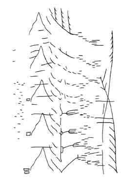
Here's a visual score for the ANS Synthesiser. Its by composer / audio engineer Stanislav Kreichi who discusses the synth and its development online. This visually appealing score reminds me of a sketch from an ecology text book. It seems to depict mountains, wind, rain and perhaps alpine vegetation. Perhaps this idea inspired Metasynth in which a very similar score of peaks, troughs and pulses can be composed visually for synthesis. I've just inverted this image and loaded it into Metasynth to hear it. Well, it sounds like it looks. In the 60s I bet that was really something! I'm not sure of the original scaling in the temporal dimension but I've played around with the mappings to have it play out over 30 seconds. Its great that a score from the 1960s can still be played on software made a few years ago.

Tuesday, September 23, 2008

the coffee van

This Sunday morning I found myself up early for the start of one of our club's bike races. After a quick trip (sadly not a pedalling trip) through the suburbs, zero traffic on the roads, I arrived at the bustling scene for set-up. Somebody had the good sense to have invited a coffee van. These are great inventions... instant cafés. (Bicycles run on coffee.) One thing I thought lacking was a set of stools for people to perch on whilst sipping their espressos. I guess most just balanced themselves on their top-tubes. The sunshine, the chatter of a race start in perfect conditions and the coming of summer were all in the air.

Besides seating, one thing lacking from coffee vans is the clink and clunk of glasses and saucers. Perhaps this could be played through a little ghetto blaster to add to the atmosphere. Actually, in consideration of one of the main themes of this blog, I suppose real glassware and saucers are in order. Disposables are not very friendly! Could used dishes be auto-washed in the back of the van somehow?

Several places in Melbourne have of course noticed in the last few years that coffee and bicycles go hand-in-hand. There's the obvious cafés in St. Kilda... home of the white shoe covers and carbon fibre Sunday wheels. But also others around suburbia are becoming haunts for cyclists. Some sit in their lycra admiring their million-dollar carbon steeds leaning against the shopfront. Some sport their mod-like outfits and retro styles (usually the fixie fadsters). Others sport bike tats (mostly die-hard messengers and messenger wannabes), and some just pootle around in everyday clothes on rusty Roadmasters dug from the depths of the shed. Good luck to you all! Enjoy your coffee :-)

Monday, September 22, 2008

what's wrong with second life? [rant]

Second Life (henceforth referred to as 2Life) is the cyberspace version of the hole in the ground on Highbury Rd. that used to be a quarry and now is trying to become (for about the third time) a middle-class housing estate. I have never been into either 2Life or the old quarry. In each case I can see an entrepreneur investing heavily in the idea and then trying to con others into believing that they should pay good money for it. You can buy real-estate in the giant hole in the ground, or in the giant hole in cyberspace. Both would be a complete waste of resources.

However undesirable living in a baking, flooding hole in the ground is, with real-estate prices in Melbourne what they are, this offers a place to put a house in which people could actually try to live a normal life (albeit with high air-conditioning and heating bills given the micro-climate of the hole).

2Life is a place for people too inhibited to dress up (judging by the screen-grabs, in bat wings, expensive dresses and enormous boots etc.) in real life or too constrained by the dress code of their 9-5 office jobs to let loose with an international assortment of others who feel a similar repressed urge. What is the point in spending money on a pretty dress for an avatar!? Are these people stupid? What is so wrong with their own real lives that they feel compelled to invent new ones and play out their fantasies from a desk chair? I could well understand if people suffering through war or the pain of terminal illness might for a moment wish to step outside of the real and enter a make-believe world in which they can, just for a moment, be someone else and somewhere else. I can also understand somebody wanting to step outside a tiring real job and other commitments for a time. But to waste resources in buying a stupid dress for a character that doesn't exist. To buy "property" and spend money on virtual "architecture" is appalling. This is just virtual decoration for a glorified chat room where people lose focus on the content of the chat and instead pride themselves on their latest pixel pot plant arrangement.

Send the money to people who need it. Make a difference to people who need it. Buy them a real house. Plant a real tree in real dirt. Don't throw parties for avatars owned by other middle-class morons with more money than sense. Brighten up a person's life by sending them a food package. Buy them a bicycle so they can get around. Send them some relief clothing instead of buying another set of pixel lingerie. You make me so mad! Wake up. You are being stupid. It is not too late. Help make somebody's FIRST and ONLY life worth living. If you are not happy with your own life and can afford to waste money in 2Life, you can afford to do something useful for yourself in real life too. Turn off your computer and go outside.

fungus spore acceleration

The acceleration record for an airborne natural system is not held by a cheetah, nor a flea. According to this video from New Scientist it is held by a fungus spore. Some fungi live in cow manure and need to be ingested by a herbivore to propagate. The spores therefore eject themselves from the dung at 25 m/s (90 km/hr). In a second from launch they travel 1,000,000 times their own body length! With acceleration like that, a Melbournian getting out of bed in the morning could expect to find himself in Brisbane before he had completely put on his slippers. Its quite amazing the stuff that comes out of dung if you take the time to look.

Thursday, September 18, 2008

death of a cyclist

Today a woman was killed by a bus as she cycled to work along Swanston St. Of course this street is an obstacle course the likes of which even Indiana Jones has never encountered. Tyre-swallowing tram tracks, huge tourist buses, erratic taxis, horses and carriages, inattentive pedestrians talking on mobile phones, 10 tonne trams, lost motorists (the street is supposed to be closed to motorists as a through-way), delivery vans and... cyclists. During shopping hours this street rates in the vicinity of "X-treme Sport". It makes a Madison seem like a jaunt by the seaside on a shopping bike.

Apparently a large number of cyclists gathered this evening to pay their respects to the deceased woman. Its marvellous that the death of a cyclist can galvanise others and for what other reason than they share a common mode of transport? This is lovely, this idea that cycling can unite people. Do motorists gather at the scene of a car crash hours after the ambulance has departed to commemorate the needless loss of life? Not as far as I know. Perhaps the friends and family might visit the place to lay a wreathe or install a cross by the roadside. Anonymous motorists don't usually attend. Do they?

Motorists isolate themselves from the world, "...in shiny metal boxes. Contestants in a suicidal race..." (The Police). Cyclists are open to the elements and often one another. I acknowledge other cyclists as I pass them in the street. The complement, the recognition of my existence, is almost always returned. Sadly this openness to the world allows a cyclist to be hit. This is always a tragedy.

R.I.P.

the ecologies project - first glance

I just ducked in to The Ecologies Project at Monash Uni's Museum of Art. The exhibition is still being set up so I'll not give a full run down, just comment on a few works that caught my attention.

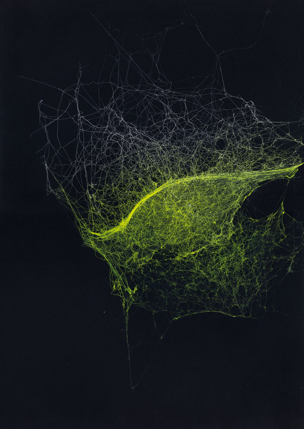
The first surprise was Sandra Selig's spider webs (image at left). Sorry, I don't know the name of the pieces — they didn't yet have a plaque. These are beautiful works, the kind of craft and aesthetics that makes me sit up and pay attention in a gallery. I was a little disappointed they were hung so high, they would reward detailed inspection. From a distance the webs appear to be interstellar clouds and have a liquidity about them that is resolved at close range into an infinity of fine thread. The luminous colours with which they are sprayed and the black background suggests that the artist too noted the potential vastness of these structures. "To see a world in a grain of sand... and all that Blakesque philosophy". Trite but true. A grey web on black has an elegance about it that the coloured forms lack. The sheen emerges instead from the varied density of the threads and the angle of the reflected light. All the same, these are lovely!

The similarity of patterns at multiple scales is a source of wonder for many scientists and artists. To see a spider's web as a colossal structure and an interstellar cloud as a tiny pattern in a lens is to muddle the usual perspective. A spider's web is an impenetrable, deadly thicket, a home, a nuisance that makes one's heart jump as it grabs at face and hair in the dark. This multi-level, visceral aspect of the thread is well captured in Selig's frames.

I'd never seen a decent print of Peter Dombrovskis' Morning Mist, Rock Island Bend, Franklin River, Tasmania (1979)... until now. This iconic image mobilised Australians as far away as Darwin to give a damn about a dam in Tasmania. It lifted the Australian conservation movement's impact up a notch and received global attention in some quarters. I place this image's cultural significance alongside the shot of blue Earth against the enormity of space. Both images reveal a world that was hidden. In each we see something worthy of protection.

The Franklin is an unseen place. Spectacular wilderness that is anything but mundane. For some, just the thought that places like this exist is necessary. Without them the world is somehow impoverished, albeit in a way that is often poorly articulated by those who have never experienced wilderness directly. (There I go complaining again about how others don't understand things as well as I do. I must break this irritating habit!) In Dombrovskis' image the river is wild, powerful and primal. This water is not just "The Franklin", it is all wild rivers, even all wilderness and this idea must be preserved. "No Dams", as a young high-school student this was (I think) the second time environmental issues appeared on my radar. The first was an effort to, "Save the Whales". I cannot recall any specific iconic image, only a pin badge I somehow acquired for the cause and non-specific footage of whales being slaughtered. Morning Mist is no 20 cent pin badge. It is the kind of accessible spectacle that hangs as well on a gallery wall, a board-room alcove, or as a poster in a politically-aware share house.

The Earth from space is in many ways the counterpoint to the Franklin. It is the everyday Earth. The planet on which we live. But its bounds are rendered explicitly. Its fragility and above all its uniqueness, dominate the image. Not its strength. The Earth is not a symbol for all planets nor is it a concept, it is just Our One Earth. On that globe all of humanity lives. All of history, all art and love and war. All the ecosystems of which we are a part share this tiny bubble in the enormity of the universe. Unlike the Franklin, the Earth is tiny, meek and mild. It is us, and we are alone. How pitiful, how insignificant are our battles. And yet, how vital it is that we fight them — from down here, the spider's web is a galaxy and we are flies trapped in it. We cannot escape to view our Earth from afar.

There's one more image (actually cinema footage) that immediately sprang to mind when I started considering Morning Mist. That's the footage of the last Thylacine pacing its cage in the Hobart Zoo (1930s). I've written about this footage before. A desperate animal, impatient, captive, the only thing certain is its death and the extinction of its kind. This sums up our colonisation of Australia, the way we treated its inhabitants and the way we continue to disrupt the ecosystems that have evolved here. We have a lot to be Sorry about.

Also in The Ecologies Project was a wall-sized video projection of an open-cut mine shot from its floor. Trucks and diggers shunted rock around a whitened, dusty landscape. The pale powder had been spread around the gallery and a rather flimsy looking white sculpture reminiscent of a drill or over-head pump had been erected here also. This work troubled me somewhat. I think the idea has potential but it fell a bit flat on first viewing. The video lacked punch, the machines lacked energy, the footage was bleached and pale, perhaps to convey the dusty greyness of the mine, perhaps the projector was just not up to the task. The sculpture looked cheap and impotent beside the seductive moving imagery. Was this deliberate?

Whilst there were several works in the exhibition I really thought were weak, this wasn't one of them. I just haven't worked out what I saw in it that kept me watching. I suspect that I have become so numbed by Hollywood's spectacular visual feats that video-art needs to pack a super-human punch to reach me or to take a completely different tack. At least the work wasn't a one-line gag!

The bleak minescape was certainly "interesting" but the video did not convey the awesome size of the site, nor the equipment, nor the immensity of the damage the mine symbolises. I think The Eden Project's breath-taking and theatrical approach is far more thought-provoking (The Eden Project was built in an old open-cut mine.) The immensity of the Grand Canyon is far more awe-inspiring. This work needs to do more than depict something that is better experienced first hand. Morning Mist succeeds where this fails because the photograph romanticises the wilderness. It takes the hard work, the biting cold, the mud and fierce rapids out of the river and leaves us with a symbol upon which to hang an imaginary wilderness. The mine footage takes all of the dust and noise out of the open-sore in the Earth, but I feel it leaves us with nothing and for this reason perhaps it failed to arrest me, despite my hope that it would.

I will revisit the gallery and see if I change my mind!

Wednesday, September 17, 2008

creative bike parking II

Earlier I put out a challenge for designing a better bike rack (David Byrne gets a D- for his poor clichés). Nobody listened to my blog post but all the same, I have now found a lovely solution, the bike tree by Abhinav Dapke!
Bikes are kept out of reach of thieves. The owner is recognised by finger print. That's a great idea... as long as you don't need to loan the key to somebody! The version installed in Geneva apparently has a smart card which is probably, ummmm, smarter. In addition it has an umbrella to keep the bikes from getting rained on. (What bit of a bike can't get rained on? I am not sure about the need for this although: (i) it keeps sheep-skin seat covers from getting soggy; (ii) it stops dirty rain marking flash paintwork; (iii) you can stand under it to eat your lunch and gaze up at the lovely bikes. The bikes are winched up using solar power too. I am truly impressed!

P.S. I hope that Noisy Mynas or Pigeons don't take up residence. Maybe some graffiti for birds is in order.

graffiti for butterflies - elliott malkin

BLDGBLOG has a link to Graffiti for Butterflies, a project that uses sunscreen and paint to post signs on walls for migrating Monarch butterflies. It's certainly out there! Why not just plant more Milkweed? Well, he did that too. I wonder if the signs painted in sunscreen are recognisable to a butterfly. It should be pretty easy to set up a controlled test to see their effect. I hope the butterflies don't come to a sticky end. At least they won't get sunburnt.

Signs that say "No Dogs on the Velodrome" in dog language would be really handy. Painting the city's statues with "No Pigeons" in pigeon-visible text would be another good application for this idea. Maybe we could protect Australia's borders from alien species in a similar way. OK, now I am being silly. The butterfly idea was cute and well-meaning. I should not be facetious. I have no idea though how you could present useful data to a butterfly or just about any other species. Route info.? This is beyond the comprehension of most taxi drivers.

Tuesday, September 16, 2008

a nest of camellias

This morning whilst I was eating my Weet-Bix a Grey Butcherbird was attempting to build a nest from pink Camellias outside our kitchen window. It would tear a flower from the tree, hop across and attempt to wedge it into a crook between two branches. Inevitably the Camellia would tumble to the ground. Unperturbed, the Butcherbird would grab another and try again. Sadly for us, and for it, the nest-construction was eventually aborted. A nest of Camellias would have been quite special! Imagine if we could all live in such a home: soft, pink, biodegradable and it requires only sunlight, water and nutrients to produce the building materials. I suspect the design might be flawed. After a few days the pinkness would be replaced with a rotten browness.

The bird could be heard singing nearby for a short time. Now it seems to have left. Oh well. Maybe an Australian native will work better. Wattle perhaps?

Friday, September 12, 2008

velodrome weather

Down here a lot of things are back-the-front. For instance, we have our track racing season in the summer. We swelter under the corrugated iron roofs of the indoor velodromes. We fry and bake in the scorching centres of the outdoor tracks, our tyres exploding at random in the heat. Sweat pours from our brows as we struggle to get a wheel or cog change made in time for the start.

The time is nigh. Today it reached 24 degrees (Celsius). Daylight savings and evening rides are coming. The summer wind gusts that make breaking away on an outdoor track a nightmare (spinning out in one straight and labouring into the gale on the opposite one) have appeared for the first time in months. All the lovely machines will be hanging for only a short time more in the garages of trackies across Melbourne. Some glint of chrome, some of blood red or deepest metallic blue. Others are shiny, curvaceous, carbon black. Soon these masterpieces of engineering will flash around the track under the Australian sun.

High pressure air escapes as tyres are inflated. Sausages sizzle on the BBQ, the smell of burning fat is nauseating. Newly spoked wheels ping and creak into place. The starter's whistle blows. Kids focus on the line: too high on the bends, too wobbly on the straights, intense concentration furrowing their brows. The girls too, although outnumbered many to one, stake out their claim to track space. Grown men tussle and strain. The bicycles flash like lightning – chrome sears retinas. The lap bell rings. The swearing begins, at oneself as much as anyone else, or at nobody in particular. Darting from within the bunch, lunging for the line, laughing from the sheer joy of it. You have survived another race. Wobbly knees, vomit rising in your throat, head throbbing, heart pounding, sweat pouring. How long until the next start?

space invaders - the new gargoyles

The Roman ruins of Pompeii and Herculaneum sat with their fantastic mosaics under ash and rubble since 79 AD until they once again saw the light of day and the tourists descended. I am particularly fond of the minotaur in the maze at Conimbriga in Portugal also.

Its amusing to think that some of the mini-murals by Parisian street artist known as Invader may be around as long. When I first saw these in the streets of Paris I wasn't sure who had made them. They cropped up in so many places, sometimes obviously threatening you from prominent architectural facades, sometimes peeping down at you from a more hidden recess. I thought perhaps they were a group-art project or a new kind of tagging.

Well, now I know that the hundreds of invaders are the work of one person. This website has maps and photographs of the invasion of Paris. The official website also has details of the international invasion including an image of the arrival of a scout in Melbourne!

Part of the appeal of these works for me is that they are scattered around the city, that with a map you can find them, and that they are aesthetically to my taste. I suppose they are like contemporary gargoyles. As an avid gargoyle spotter I can only say this invasion is very cute!

Wednesday, September 10, 2008

multiple, multiples - chris jordan


Chris Jordan builds images from tiny elements that are themselves the item whose consumption he wishes to visualise. For instance, he draws attention to the US statistics on : plastic cups used and discarded by airlines, paper coffee cups, Energizer batteries, breast enhancement surgery, deaths caused by smoking, prisoners incarcerated etc. His art becomes a bit monotonous unfortunately. The point is that these numbers are huge and according to his presentation, he would like the US society (others too I expect) to look at itself and understand the impact of individual decisions and lifestyles. After viewing two or three of his works I am no longer engaged. Yes, the numbers are staggering. The art needs to be more than a pretty visualisation of daunting numbers to keep me interested.

Tuesday, September 9, 2008

suburban wetlands - ecosonics

I used to live about a ten minute walk from a creek and surrounds that, long ago, used to be a wetland. Then it was just a suburban drain in a strip of land between a freeway and some cricket pitches and monitored by massive power-pylon robot-monsters. Then it was remade into a wetland again, complete with a secluded bird-watch. I used to regularly scoot down to the waterside on a hot Summer's evening to enjoy the frogs' competition with the nearby freeway traffic noise. I have since moved house.

As Spring has now arrived I am very pleased to find that once again the frogs are near at hand. I was out at midday, at last enjoying some sunshine, and I found myself in a wetland a 20 minute walk away — quite manageable and well worth the steep return trip. The frogs were making a lovely din that completely drowned out any traffic. That is quite a feat in suburban Melbourne! Its a shame about the ever-present DIY renovation junkies and their circular saws and routers. Even the frogs were stretched by this competition. Why aren't people happy with their homes as they are? Anyway...

I heard at least three frogs. Thanks to the marvellous Frogs of Australia website's audio resources and a CD of Australian frog-calls, I can say with (shaky) confidence that I heard: the Eastern Common Froglet; the Eastern Banjo Frog (I prefer its other name, the Pobblebonk); and lastly, a frog that made a very short, percussive "click" sound. I suspect this was the Spotted Marsh Frog. If not, it may have been the Striped Marsh Frog (named like an Italian beer, Limnodynastes Peroni). The frogs were set off delicately (!?) by the screech of playing Lorikeets, the warbling of Magpies and the playful antics of the native Noisy Miners.

These local wetlands are absolutely brilliant. I wish all storm-water drains and creeks could be de-concreted and replanted. The urban sonic environment would benefit immensely.

Friday, September 5, 2008

diorama gallery

The American Museum of Natural History has some lovely dioramas... and they are illustrated in the diorama gallery on their website! I adore these miniature worlds. An African plain, Californian valley, an Asian mountain range or an Australian desert all can be compressed into a virtual, tardis-like space along with the appropriate flora and fauna. A long walk for little legs can take a kid from one window to the next and an opportunity to gaze into the world's habitats. Is there anything more comforting than strolling down the halls of a museum at a travel destination and encountering a scene taken from the forest back home?

Of course at home in Melbourne's Museum Victoria we have had some fascinating dioramas also. I suspect that they may no longer exist. Please somebody tell me I am wrong! That would be a serious loss. Of course they reflected 1950s attitudes to Australian Aborigines in particular and present our landscape in simplistic, romantic ways. They are icons of their time, like Women's Weekly advertisements for white-goods aimed at Anglo-Saxon housewives and nuclear families. Australia's landscape is an integral part of the identity of the European settlers who colonised it and those who migrated here much later (but have taken the time to get out of the metropolises along its eastern seaboard).

Viewing the continent's flora and fauna from behind the glass wall of a museum exhibition is quite appropriate. We see the landscape as outsiders, peering in on a strange diorama, limited in the range of perspectives we adopt by the cultural baggage we have carried with us from Europe. Who are we staring at? It used to be that we stared at the Aboriginal people, standing holding spears and boomerangs in a dusty, grass-dotted plane, roasting a lace monitor on the fire. They belonged in the landscape with the kangaroos and koalas. We gawked stupidly from behind the safety of the glass.

But here we are, shaping the diorama as we see fit. Placing its inhabitants in idyllic hunter-gatherer settings that romanticise the history we cruelly interrupted, whilst hiding its difficulties and completely ignoring the damage we continue to inflict. Living here is a wonderful privilege, the cost of which has been born by others. Who'd have thought a museum diorama could hold so much?

Thursday, September 4, 2008

spatial ecosystems - Motomichi Nakamura

The images of Motomichi Nakamura like that at left feel like "spatial ecosystems". The organisms' forms are constrained by their neighbours' and the space as a whole. Where there is a niche an organism has become especially suited to it.

The only spatial aspect I feel to be missing is hierarchy. I.e. the images would be more ecosystem-like if some organism's bodies were rendered inside the bodies of others. I don't think this is one of the artist's concerns though :-)

colour and pain II

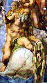
As I flicked through some travel photos from a few years ago, I note that I inadvertently photographed Bartholomew, a Christian saint who was flayed alive, as illustrated in vibrant colour by Michelangelo on the wall of the Sistine Chapel. Bartholomew is pictured holding his own skin as he ascends to heaven. He doesn't look as horrific as one might expect for a person just flayed. In fact he has regrown his original skin and carries his old one like a winter coat. One weird thing about the image is that Michelangelo apparently painted his self-portrait into the flayed skin as some kind of protest about the way he and his art were being treated by the priesthood... no nude saints on the walls of the Sistine Chapel thanks! What did the priests think of all of the ancient Roman statues I wonder?

This ghastly event (flaying I mean, not nudity or painting) links neatly with a Ted.com talk by Steven Pinker on violence and another by Daniel Goleman on compassion. Firstly, Pinker gives a reasonable argument that even taking into account the current conflicts and violence, overall the world is now a much less violent place than it has been in the past. For instance, flaying might still occur in some countries, but this is no longer the norm. Seldom are people executed or de-limbed for small misdemeanors as they might have been in the past. In some countries you can still suffer torture and internment for speaking out against the government. But we in the developed world are made aware of this often by the media. It sticks in our minds. We notice and sometimes complain.

Goleman explains his belief that empathy and compassion are intrinsic parts of being human. We are hard-wired this way. Sometimes though we are so concerned with our own circumstances, even if it is just that we are running late for an appointment, that we forget to switch on empathy for those who might be right in front of us. He feels that if we allow ourselves to be this self-centered we are not being as human as we might.

So, it sounds like I am preaching a sermon here. But all of this investigation led me via a strange route to discover a website with photographs of an execution by quartering. The site shows a long series of black and white photographs that were shot in Beijing, 1905 and distributed as picture postcards! Can you believe it? The first time I discovered the site I could not bring myself to look in detail at the images or captions. I have just done so. The fact that the images are black and white makes the whole scene more macabre and less like the anatomy texts I have been perusing lately. It takes on an unreal quality about it until one flicks the "empathy" switch. With this engaged I feel sick to the stomach. I won't link to the site from here. I can only guess that the hoards of onlookers at the execution must have had their empathy firmly planted at the back of their brains. These images are no "Bartholomew on his way to heaven". Their stark reality would really have been something for the priesthood to get upset about. Perhaps a few less religious wars, inquisitions and torture sessions might have benefited the world.

The surgeon cuts and repairs. The torturer cuts and destroys.

Wednesday, September 3, 2008

the flexipede

1967, 2 mins, film: 16mm, colour, sound.

This image is from the computer animation The Flexipede by Tony Pritchett. The film was apparently the first computer animation produced in Britain. It was made with the help of the University of London's Atlas computer using its programming language Autocode. Flexipede's soundtrack was produced using foley techniques. The film was first shown publicly at the Cybernetic Serendipity exhibition (1968).

environmentally unfriendly LCDs

Computers involve environmentally toxic manufacturing processes. These machines and their trim are nasty! The lifetime of a computer (for somebody who works in computer science) is limited to a few years at most. One can try to stretch this out, perhaps to five years, by carefully selecting new models and soldiering through operating system and software upgrades stoically. So far this Powerbook G4 has served me well for 4 years (OK, I needed to replace a dud hard drive).

My recent street rambles have occurred during our suburb's hard rubbish collection. The number of CRT monitors and TVs piled on people's nature strips is astonishing. The LCD revolution is here with its promise of clearer pictures, less energy consumption and flat, elegant displays. But, is there a cost? LCD monitors consume less power during their use and so the naive assumption people make is that CRTs should be replaced with this new technology to "green up an office".

Unfortunately, such replacement is not necessarily a good thing. The paper, Life-cycle environmental impacts of CRT and LCD desktop monitors (by Socolof, M.L.; Overly, J.G.; Kincaid, L.E.; Dhingra, R.; Singh, D.; Hart, K.M. in Proceedings of the 2001 IEEE International Symposium on Electronics and the Environment, 2001, pp. 119 - 127) compared LCD and CRT environmental impacts. It assumed in its survey that the monitors were replaced after the same period and for technological upgrade, rather than because the device had failed. The analysis, taking into account potential sources of error in the data, investigated 16 components of the impact of the production, use and decommissioning of these monitors: non-renewable resource use; renewable resource use; energy use; global warming; ozone depletion; air acidification; photochemical smog; air particulate matter; aesthetics (odor); water eutrophication; water quality: biological oxygen demand; water quality: total suspended solids; hazardous waste: landfill space use; solid waste: landfill space use; radioactive waste: landfill space use; radioactivity.

Energy cost and global warming contribution were given special attention in the paper. The CRT requires a lot of manufacturing energy, in particular for glass. This is the most significant factor, and exceeds by far the amount of energy that these monitors consume in use. CRTs consume more energy in production and during their life cycle than LCDs. LCDs do not consume as much energy in production, nor do they consume as much electricity during use. (Although interestingly enough, they are nastier in production than CRTs in almost all other ways - a point for another day!)

Global warming contributions of the monitors is however the reverse of what one might expect from considering energy consumption. The main global warming contribution of CRTs comes from electricity consumption during their use. During their manufacture, various forms of energy production are employed and these do not all uniformly contribute to global warming. LCDs, as noted above, consume less energy to manufacture and use than CRTs, but in the manufacturing process sulfur hexafluoride (SF6) is employed and this swings the pendulum against the LCD when considering global warming contributions:

"According to the Intergovernmental Panel on Climate Change, SF6 is the most potent greenhouse gas that it has evaluated, with a global warming potential of 22,200 times that of CO2 over a 100 year period" (Science Daily)

Oh dear, we are not saving the planet by throwing out energy hungry CRTs. Instead we are worsening the situation by increasing the manufacture of LCDs and tossing out CRTs that may have had a good few years left in them, their manufacture being the dominant component of their energy cost, even if not their contribution to global warming.

So what should we do? My suggestion is to keep CRTs until they are worn out and use 100% renewable, green energy to avoid the CRTs making any further contribution to global warming. Simple!

Of course since LCD monitors certainly consume less energy in use than the CRTs and energy consumption is measurable by business on an energy supplier's bill, changing to LCD is an easy way to make documented claims about "being green". I suspect this naive approach will be more likely to occur. Anyway, LCDs are much slicker technology and take up less desk space so that we can reduce office sizes and save on rent, heating and air-conditioning bills :-)

Face it. Computers and electronics are environmentally toxic. Use them for as long as you can and on green power. Resist the urge to upgrade.

Friday, August 29, 2008

no gunns blazing

ABC News Radio this morning reported that Gunns is having trouble finding financial backers for its proposed pulp mill in Tasmania's Tamar valley, following the withdrawal of the ANZ bank earlier this year. Gunns apparently admitted that the pulp mill might never be built. One can only hope!

The Wilderness Society is continuing to raise awareness of the significance of the region and the detrimental effects the mill would have on the environment. According to the radio report, there is concern that the forestry industry in the region might collapse if the mill isn't built. How long could the industry log the region before its resources were exhausted and the industry collapsed in the region anyway? Long enough for the loggers' children to have trees to fell?

Its interesting how the Wilderness Society is now approaching the need for conservation of these forests. With climate change on the agenda the forests' utility as a Carbon sink is coming to the fore. This new angle of attack would have had no impact 10 years ago. Times have changed.

The Ecologies Project - Monash Uni. Museum of Art

17 September 2008 - 22 November 2008

Opening function: Saturday 20 September 2008, 2pm
Curators: Geraldine Barlow and Dr Kyla McFarlane

Pre-opening curator's talk
Saturday 20 September at 1.30pm

Opening function
Saturday 20 September at 2.00pm
Monash University Museum of Art, Clayton Campus
With opening remarks at 2:45pm
by Professorial Fellow John Thwaites, Chairman of the Monash Sustainability Institute, and Former Deputy Victorian Premier and Minister for Environment, Water and Climate Change

What is this project that we are now undertaking, as we globally seek a new balance with the ecological systems that sustain us?

Will endgame, apocalyptic visions drive change, or can our wonder in the natural world inspire the creation of a brighter future?

Artists have long drawn inspiration from nature, as well as being advocates for a sustainable relationship between humanity and the environment. Now that a need for change has become broadly accepted, what role for art? Even with this accepted impetus to action, the particular paths we might take are unclear. It is an exciting and unsettling time as we sit between the darkest and most hopeful of futures. We must grapple with a myriad of abstract and interconnected systems, economic, environmental, social and philosophical. At this moment in time, art offers a lens through which we can examine the world as well as a kind of metaphorical thinking that can sharpen our perception of the relation between these complex parts and their impact on a dynamic whole. The Ecologies Project includes work by 40 artists exploring issues of sustainability, climate change and the idea of ecology as both form and metaphor.

LAURENCE ABERHART | LAUREN BERKOWITZ | CHRIS BOND | ANGELA BRENNAN | PAUL BUWANG BUWANG | JANET BURCHILL AND JENNIFER McCAMLEY | JOYCE CAMPBELL | MIKALA DWYER | MICHAEL CORRIDORE | PETER DOMBROVSKIS | BRODIE ELLIS | ANNA EPHRAIM | GALI YALKARRIWUY GURRUWIWI | ANDREW HAZEWINKEL | SUSAN JACOBS | ASH KEATING | NICK MANGAN | DHUWARRWARR MARIKA | MANDY MARTIN | VERA MÖLLER | JAMES MORRISON | ANNE NOBLE | HENRY NUPURRA | RAQUEL ORMELLA | FIONA PARDINGTON | LUKE PITHER | ADAM PYETT | STUART RINGHOLT | EWEN ROSS | SANDRA SELIG | ANDREW SINCLAIR | EILEEN YARITJA STEVENS | LISA STEWART | RICKY SWALLOW | CHRISTIAN THOMPSON | MICHELLE USSHER | ROHAN WEALLEANS | ROY WIGGAN | JOHN WOLSELEY

Thursday, August 28, 2008

mind the gap: animated data

Hans Rosling, professor of global health at Sweden’s Karolinska Institute, gives an animated talk employing animated data on the TED website. In addition to the demonstration of his very cute data-visualisation software, Trendalyzer, the talk discusses the relationships between a nation's child mortality rates, GDP, family size and various other values. Some surprising (to me anyway) trends from the last 40 years of worldwide development are revealed. In particular, there does seem to be a global upturn in health as measured by these simple statistics. The spread of wealth seems to be flattening across the nations, and the health and wealth of the "developing world" is approaching that of the West. However when viewing statistics within each country, similar trends are not necessarily present, the divide between haves and have-nots remains.

More information on the software and associated projects is available from Rosling's not-for-profit organisation, Gapminder. A quick play reveals Australia is up there with Japan and Switzerland amongst the very top few nations for life expectancy. As individuals we don't quite have the material wealth of some other countries (e.g. Luxembourg!), but we seem to live a couple of years longer. We also emit a lot of CO2. I wonder if data is available to compare the number of stadia, museums and art galleries, theatres and concert halls per capita between countries. Just curious.

Tuesday, August 26, 2008

bicycle vibrations - james angus

By a strange, circuitous route, I just discovered this exhibition record at Roslyn Oxley galleries, Bicycles 2007 by Australian artist James Angus.

...I'm yet to see one of these lovely bikes in the flesh (there is an orange machine with drop-bars at the Ian Potter gallery for the Basil-Sellers prize) but if the photographs are anything to go by they are marvelous sculptures. Not one bicycle, but three, or two? Or is it one bicycle that has been abused by a few too many road vibrations? Perhaps it is shaking its soul free. Perhaps I have had too much to drink. Its hard to tell what these feel like from photographs alone so I will wait until I visit the exhibition before I write anything much about the work.

I wonder at the artist's choice of seat cluster. By attaching the seat-stays so low on the seat tube the elegance of the traditional dual-triangle frame is compromised. This is especially noticeable when contrasted against the smooth lines of the drop bars on the sculpture entered for the Sellers prize. I can only assume the choice is a deliberate attempt to sculpturally dislocate the machine. What lively and seductive sculptures! I wonder if I could get a ride on one? :-)

Monday, August 25, 2008

middle-class ruins

My favourite suburban architecture is the "middle-class ruin". There are a few gems around although they are becoming scarce as developers take hold. Once lovely weather-board homes have been left to fade in middle-class leafy streets. Their elderly occupants do likewise as the lawn threatens to swallow them and their decrepit, unpainted coffins whole.

Not far from my house one of these is piled under tons of scrap metal, old fence posts and palings, rusty car doors and broken garden furniture. If the house wasn't positioned prominently on a slope overlooking the street, the entire block would look like a junk yard. Instead the house, its balcony crammed to the rafters with detritus, displays its face to the middle-class street. It defies the trim lawns and designer landscape gardens, the ecologically sound architecture with four-wheel drive tanks parked in the driveways to lodge a complaint.

In the wilderness between my home and work a derelict building site for a dream home lies frozen at the moment the money ran out. Neatly stacked timber and bricks are succumbing to dandelions, uncut grass and ivy. Kids have smashed the windowpanes and scrawled tags on the rendered walls. Bright fingers of electrical wiring emerge from a hole in the eaves over the front door. Are they clutching at the space where a light fitting was supposed to be?

An abandoned swimming pool. Its blue paint is cracking and peeling. Slimy black sludge has collected at the deep end. A few straggly weeds are sprouting here too. In spring they'll flower into pretty, white daisies. Is that the corpse of a possum or a cat down there?

There are places even in Melbourne's suburban sprawl where the imagination can roam free.

Saturday, August 23, 2008

library of dust

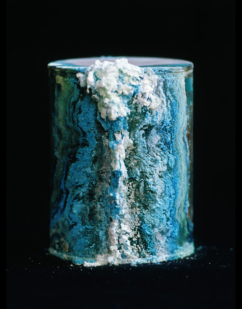
In keeping with the themes of biology and decay, I stumbled on a post (on BLDG BLOG) about a book, Library of Dust. The book is a collection of photographs of unclaimed, cremated human remains from a psychiatric hospital — compacted and tinned humans, stored like corn and beans on a supermarket shelf!

Unlike the bones of the catacombs beneath Paris or the ossuary of Sedlec, the human form of the remains has been completely obliterated. Whilst the bones of Paris and Sedlec have been jumbled, these human remains have been kept separate from one another. Each can of ashes leaves its unique, visible mark on the world through the patterns of corrosion on its surface. The ex-patients may have been tinned and stacked, but they regain a unique identity in a most unlikely way. Library of Dust is a strange, visually arresting and thought provoking record of people past.

Image: From Library of Dust by David Maisel, published by Chronicle Books

athletics, Muybridge and the red queen

Shot type 1: Its over 100 years since Muybridge's death and I find myself glued to the television to appreciate an idea that originated with him. The Olympic Games have been two weeks of the most beautiful pictures of human physiology I have ever seen. My favourite shot is certainly the slow motion tracking camera that follows alongside a sprint or gymnastic tumble.
I first consciously appreciated this shot as the final sprint in the Tour de France exploded along the Champs Elysées a few years ago. The lens does not distort the perspective as it would when using a distant telephoto. The angle remains fixed. The background tears past at a terrifying rate, the cyclists are trapped in the frame like the Red Queen, legs ablaze, faces straining, backs arched before a final throw for the line. And the whole thing can be repeated at a fraction of race pace so that you can take it all in: muscles ripple, sweat collects on noses and jaws before gracefully lifting from the grimacing face to glide away and off-screen.
The same shot applied to athletics, especially the 100m sprint, reveals the wealth of detail Muybridge captured. The form of a top class runner is a gorgeous sight that can best be appreciated in this slow motion tracking shot. The technique allows the repetition of the cycle to be appreciated. For just short of fifty paces the best runners maintain a fluidity that belies the effort it requires. In less than 10 seconds the race is all over, the medals are decided, the athletes are ecstatic and bounce around, or they are shattered and collapse in tears on the track. Years of effort to produce 10 seconds of glorious physiological poetry. Thanks, your effort is appreciated... especially by the airlines, fast-food chains. vehicle manufacturers and banks whose advertisements I had to endure... but also by the millions of other crazy people like me who tuned in to admire technology's view of the body in motion.

Shot type 2: The photo-finish is also a fascinating piece of work. In this, slices of the athletes as they cross the line are compiled into a single image with a timing scale marked along the image's edge. Lines placed on the image at the point where an athlete's chest (or front bicycle wheel) first touch the line may then be read off the timing scale to determine their time. The distorted forms of the athletes look less than elegant, but the image is a great way to reveal a winner.

Friday, August 22, 2008

artistic bicycle racks

Some amusing New York city bicycle racks designed by David Byrne are to be employed for a year and sold as art afterwards. Utilitarian "street furniture" never looked so... tacky? They're not amongst my favourites but neither are they as bad as the usual water-piping trusses found in school-yards and train stations across the world.

The stainless-steel "circle emerging from the footpath" is more a elegant design. Unfortunately like most designs it needs a long chain or cable to secure both wheels unless the rider removes the front one and locks it beside the frame and rear wheel. Is there a design that is secure, nestles the front wheel and bicycle into a situation from which they can't be removed without a key, and doesn't scratch the frame? Bike lockers are a good idea but very space-hungry and easy to hog with a single padlock, regardless of whether there is a bike inside. A better design is needed.

The Japanese have a couple of ideas that work with varying degrees of success. The supervised bike parking station, and the unsupervised footpath crammed for hundreds of meters with countless unlocked (or poorly locked) bikes. The latter option works on the principle of safety in numbers employed by fish schools and zebra herds.

foul foods of the world

I've not yet tried surströmming (fermented herring). I have tried nattō (fermented soya beans) and blue-vein cheese. Contrary to our gut feelings, they are actually good to eat. Why should we "acquire" a taste for something that our reflexes guard so strongly against? Is this a bit like the thrill of bungee-jumping? Despite all our senses telling us to refrain, we overcome our innate fear of food with reason, chew, swallow, and smile with exhilaration.

Thursday, August 21, 2008

colour and pain

It never really concerned me before if I experienced "red" in the "same way" as somebody else. Did I experience it myself in the same way from day to day? I could see why it might be interesting to contemplate this but its not something I would invest my life in wondering or writing about. But recently something of similar experiential origins has changed the way I think about perception --- pain!

The experience of chronic pain completely changes the way the world is perceived. Focusing on things outside of the body becomes extremely difficult, if not impossible, and attention is directed inwards. Everything that does come "from outside" passes through a filter that renders it of such a low priority that what was dominant without the pain may become completely insignificant with it. How much of this pain originates from the injury or other problem? How much is concerned purely with the brain's response to the pain it perceives and is entangled with the sufferer's mental state (including their expectations and fear of the injury)?

Of course the whole situation is distressing also for those around the sufferer because the person they used to know no longer engages with them as expected. The sufferer becomes "a different person". Their internal state is completely altering their external appearance and interactions yet there may be no externally obvious reason for this. Outsiders simply need to rely on the pain sufferer articulating the experience and a large dose of empathy.

...and then along comes an external agent and removes the source of the pain. As if a switch was flicked the world of the former sufferer changes colour again. What has changed? It may be a physically (or chemically) tiny thing that was causing such a dramatic perceptual reconfiguration and now it is gone or mended. Or is it only that the mental state of the sufferer has gone from one of "victim" to one of "saved"?

Once pain's filter has been experienced and has ground its way into the sufferer's consciousness over time, everything outside looks slightly different. Is the red seen now the same as the red seen before the pain? Is it the same red that was seen during the pain? These appear to be three different colours. But in what sense could it be said that they are different? To what extent does previous experience change our perception of something as physical (cf. conceptual) as the present experience of colour?

I feel this demonstrates simply and clearly how wrong any artist (e.g. Kandinsky) is when attempting to discern the absolute properties of various colours. The idea is ridiculous.

Wednesday, August 20, 2008

notes on monuments

Note 1. In the paper, Public Monuments, from Alan Sonfist's contribution to Artful Ecologies, University College Falmouth, 2006, pp 9-10, the artist reiterates some of his ideas from the late 60's. Specifically, he suggests that a city should erect public monuments to commemorate the natural systems that they replace. We are all familiar with memorial statues, plaques, monoliths, commemorative parks and gardens, even symbolic trees. But these are usually placed in recognition of significant human events such as wars, adventures, political careers, lives spent in service of the poor or perhaps the prior existence of an important civil building or the residence of a respected citizen. Sonfist wishes for monuments to be made for nature. Why not place a reminder of a river that has been lost? A copse of trees to commemorate a forest that was axed?

Note 2. A monument is, by definition, something that aims for the permanence of stone. The ancient Egyptians had this idea and it has been dominant right through the Greek and Roman periods, the Middle Ages and Renaissance right up until the present day. The art of sculpture took until the 20th century to overcome its obsession with monolithic forms carved from stone or cast in bronze (See Herbert Ferber, On Sculpture, 1954). On human time-scales these massive works are sturdy yet... Andy Goldsworthy remarked when observing the stone about him (documentary, Rivers and Tides, 2000), that where it has bent and buckled in its molten form, or where it has crumbled and decayed through weathering to be returned to dust and recycled by the same processes that created it, it is easy to see that even stone is fluid. A geologist works with this same fluidity on a massive scale. A rock climber recognises stone's seams and pockets, bubbles and streams at the macro level. Yet humans are short-lived and physically weak so of course stone is for us a powerful symbol.

Note 3. A planted tree has an immensity, power and above all a dignity about it that a stone monument can never have. A tree, like us, has a beginning and an end, even if these are thousands of years apart. A tree also has the active force of any organism. A tree makes a lovely symbol without the arrogance of stone. The tree retains its own identity even when used as a symbol. A stone's identity is stripped when it becomes a monument.

Note 4. The act of scratching a person's name into a cut stone as a long-term reminder of their existence, presence or passing is ancient. Have such cuts been made in living trees for as long? What is the first evidence for the practice?

(Examples: the Dig Tree in Queensland has become an icon due to the unique set of circumstances surrounding its carving. The Sister Rocks near Stawell in Victoria are an indication of just how arrogant and ugly people can be.)

Image credit: picture from Wikipedia of the (ugly!) stone monument in Royal Park to commemorate Burke and Wills' expedition departure in 1860 from the site.