Showing posts with label art. Show all posts

Monday, September 26, 2011

mary shelley's moonlit window

"In August 2010, Professor Olson, two colleagues and two students went to Lake Geneva to discover when moonlight would have hit the windows, and penetrated the shutters, of Mary Shelley's bedroom." In this way, and by looking up their astro. tables, they aimed to date the birth of her famous tale, Frankenstein; or, The Modern Prometheus (1818) [The Guardian].

"It was a strong effort of the spirit of good; but it was ineffectual. Destiny was too potent, and her immutable laws had decreed my utter and terrible destruction" – wrote the poor Doctor in Shelley's tale (chapt 2).

If Shelley had her way, perhaps there would be no field of Artificial Life. If we took her text to heart, should we all stop now? Perhaps, like nuclear physics, the potential to make a mess of things is too great? And yet, here we are, pushing onwards in an effort to create life. Ahhh... what would a girl in her late teenage years know about the future of the world anyway?

Friday, July 22, 2011

alexander calder

I just discovered online this image by Calder... Six Day Bike Race, 1924, oil on canvas, 30 by 30 inches, Calder Foundation, New York. Nice and seedy, just like the 6 day races. Was this a conscious inspiration for the work in Paris by Alexandre Ganesco, Les "Six Jours", 1930!? The two have a lot in common. Maybe that is just the subject matter. To do: attend smelly, noisy 6 day race in Belgium.

Wednesday, July 21, 2010

natalia goncharova & lill tschudi

I just stumbled on the image at left, The Cyclist (1913) by Russian futurist (amongst other things) artist, Natalia Goncharova. I love the palette, the graphic text and the subject matter but as an image, well, it is not a favourite. The cyclist isn't moving — it is more like I am looking across from a vantage point on my own bike at a fellow rider as the two of us struggle along a section of pavé – the viewer is being jiggled around.

Still, it is terrific to find such an image by a female artist. I am aware of another image by a woman on which I am more keen. It is the Tour de Suisse (1935) linocut by Swiss artist Lill Tschudi.

Whilst it contains static elements the overall effect is of dizzying, sweeping curves. Tschudi's image captures the craziness of a descent. She has forced the tight bends and insane cornering forces into a tiny space as if the riders and their machines are threatening to miss a turn and careen through the edges of the paper. This latter image is quite terrific and, I think, superior to the earlier work by Goncharova.

Sunday, December 6, 2009

ricky swallow

I had no preconceptions about what I would see at Ricky Swallow and was thrilled by what was there. The only downside to the exhibition was that there wasn't enough of it!

Despite appearances, the work at left, Peugeot Taipian, Commemorative Model (Discontinued Line), PVC Pipe, Plastic Sheeting, epoxy, 1999 scale 1:1 (photo by Kenneth Pleban) only just came to my attention a moment ago and wasn't what drew me to the exhibition. In fact, this work wasn't in the exhibition at the NGV Ian Potter Centre. Instead, The Bricoleur exhibition contained a fascinating collection of non-cycling related wood carvings, bronze sculptures and some works on paper. The carvings in particular were spectacular investments of time and energy and evidence that the craft of art-making is held in high esteem by some. A 1:1 scale dining table still-life, littered with seafood and other astonishing adornments was the largest and most striking evidence of this fact, but not my favourite...

The signature image of the exhibition was Tusk (2007), two disembodied, skeletal arms, their hands clasped as they hang naturally from the wall as if on a shared stroll. I didn't mourn for the long-since decomposed couple, whoever they were. They seemed content to wander throughout eternity in this bizarre form. The work improves upon the arrangements of bones I have seen around the European tourist sites (such as the Sedlec ossuary in the Czech Republic). It takes the human fascination with mortality and twists it out of range of those who would terrify followers with threats of hell. So often in Italy for instance are the churches scattered with momento mori of similarly bony form, yet what seems to be an opposite message.

Fig 1. (2008) was a naturally finished wood carving of a skull wrapped in something that might have been brown paper. It reminded me at once of my lunch and a museum artefact wrapped for storage in a musty drawer. Without the wall-plaque it was not obvious what was hidden within the paper wrapping... a mystery object that, perhaps would have been more interesting left unspecified. The wood lost its solidity. I expected it would make un-crumpling sounds if I touched it.

The bronze Caravan (2008) was a great idea... barnacles growing on balloons. But the choice of material didn't work for me. It said nothing about balloons' vulnerability or their short lifespans. In fact they hardly felt like balloons at all.

Unbroken Ways (for Derek Bailey) (2006) was a free-floating arm, hanging limply down the wall. While the bronze balloons didn't work at all, from a distance, the texture of the wood in this piece was so gently carved and texturally reminiscent of flesh that I had to look twice to be sure of what I was seeing. Although a slightly different pose, the limb hangs in a way strongly reminiscent of that belonging to the freshly murdered Marat in the famous work by Jacques Louis David (1793). Swallow's work was really beautiful in this case. The arm appeared to possess a pulse. Had it reached out towards me as I left the gallery I would not have been surprised.

Tuesday, November 3, 2009

the butterfly and the bicycle

How many butterflies died in the making of this Hirst-Armstrong-Trek bicycle? I prefer Damien Hirst's shark, The Physical Impossibility of Death in the Mind of Someone Living (1991). The shark shows some understanding of the essence of life (and death) and fear and decay and nature and the sublime... lots of things really.

The Trek is something a little girl might do with her first bicycle and a sheet full of butterfly wing stickers from the supermarket. It is unimaginative and completely ignores the form of the machine. It is considerably less than I would expect from an artist of Hirst's reputation. It is of course big news (it even makes it onto this blog for instance) because it is a Hirst, and an Armstrong, and for "a good cause". But not because it is good. Disappointing.

This Marc Newson TT bike really works I think. For the most part the bike has been left alone, but its disc is rounder than round. At first I thought the design a little gimmicky but it is growing on me. It doesn't interfere with the bike's lines (which I have to say, coming from Trek are not in and of themselves anything to write home about – Trek should look at Pinarello or Ridley or even Specialized dare I say it, to see how to make a lovely and fast TT machine) but it adds a kind of rolling oomph to the machine, like it is being propelled from the rear towards warp speed. Whilst quite geometric, the design is simultaneously very organic. A good crossover point between the human and his machine. I love this one!

Wednesday, October 7, 2009

len lye

I went along to see the Len Lye exhibition at ACMI last Friday... I'm glad I didn't miss it. The kinetic sculptural works in particular are fantastic, amongst my very favourites. There was also a large collection of his sketches and screenings of his innovative scratched film works which are fun to watch but not amongst my favourite pieces of cinema. All the same, for the sculptures – I find them completely mesmerising, in particular Grass (1961-1965, photograph by Nolan Bradbury / ACMI above left) – I highly recommend this exhibition!

Tuesday, July 21, 2009

La France

For better or for worse, here are some minor thoughts I digitally jotted down during a recent trip to Paris.

Sculpture. In the gardens of the Louvre is a bronze sculpture of a reclining female nude. A succession of (mostly but not exclusively) male tourists are posing for photos embraced by her arms and legs. How many times has she endured this as she stares passively into the space just beyond her outstretched hand? What is she reaching for? Tourists?

The new tourists. All around Paris I see groups of well-groomed American girls. Are they out of school on a communal gap year? They are polite but their accents grate through no fault of their own. "Yeah... Like... Yeah... Mercy. Or rev-woir". They are practicing their French just like me. I bet my accent is ghastly to the locals :-)

Baguettes.
The French certainly love their baguettes! At breakfast and at lunchtime, I have seen them walking the streets, brandishing their sticks of bread by a sheaf of wrapped paper. Much of the world has succumbed to practicality and carries a compact loaf. Still, there is something comical about a handlebar-mounted pannier with a baguette thrusting it's nose into the air ahead of the rider. This makes their perseverance endearing.

Velolib. I watched a guy pedal his bicycle from the hire racks down a cobbled lane. His girlfriend was perched cheerfully on the handlebars, facing him. This didn't improve the steering any, but the view was always to his taste.

Tour de France reporters. The sport presenters discussing the TDF this morning were two gorgeous, eye fluttering, posing blonde dolls. Why do we get Mike Tomalaris? SBS should import some European talent.

Foreigners in hotels. It can be funny leaving a foreign hotel frequented by tourists. This morning I was greeted by an American on the stairs in French. Later, a Chinese man and I awkwardly smiled as we passed in the corridor, unsure how to greet one another. There was a good chance he was Australian.

Friday, December 19, 2008

what is sport? - roland barthes

(Translated by Richard Howard, published by Yale University Press, 2007)

This little book is a gem. It is originally a script Barthes prepared for a Canadian documentary. The French philosopher (I can say that here without groaning) explores the role of five national sports including the Tour De France and Spanish bull-fighting. What pearls of wisdom does he have to offer? Several, and also a writing style in translation that is lovely to recite.

A man alone, with no other weapon than a slender beribboned hook, will tease the bull: call out to him... stab him lightly... insouciantly slip away.

But Barthes is not blind to Spain's obsession. He comprehends the significance of the bull's death and places this archaic ritual as a tragedy in four acts. I shan't spoil the fun by telling more since Barthes' short piece of narration will occupy your eyes for only a few minutes. Still, it has the potential to occupy your thoughts for some time to come.
...the Tour is incorporated into the depths of France; in it each Frenchman discovers his own houses and monuments, his provincial present and his ancient past. It has been said that the Frenchman is not much of a geographer: his geography is not that of books, it is that of the Tour; each year, by means of the Tour, he knows the length of his coasts and the height of his mountains...

There is no doubt that sport dictates the ebb and flow of Melbourne. Does a Melbournian measure train trips according to the number of stops before or after Richmond and the MCG? Time according to the number of days before or after the Grand Final? (Or on a shorter scale, before or after half-time?) Can weather be associated with cricket, tennis or football seasons?

Anecdotally (and I suspect supported by statistics that I admit I have not recently consulted), the waves and surges of fans and participants that enter our cricket grounds, football ovals, tennis courts, velodromes, athletic tracks, swimming pools, gymnasia, hockey pitches and even our lawn bowls greens, far outweigh the streams that attend or present at art galleries and live performances.

Melbourne prides itself on being a "cultural capital". Do the bean-counters still employ the trick of including sporting events as a cultural activity? Is riding down Beach Rd. in a 100 strong bunch of lycra-glad, carbon and Campagnolo wielding men cultural? Or sub-cultural? ;-) Given the chance, on a balmy summer's evening, I'm a sucker for the buzz of freewheels or the grumble of boards under a sprinting bunch. All the better if my freewheel buzz or my wheels' thunder adds to the melee. Hopefully I can participate with style.

Style? Here Barthes again has a lovely way with words.

Style makes a difficult action into a graceful gesture, introduces rhythm into fatality. Style is to be courageous without disorder, to give necessity the appearance of freedom.

So what is Sport? Sublime. Sublime in the way a practiced artist wields a brush, a baton, breathes life into a flute or a character. Sublime also in the way a sculptor forms a marvel from a mass. Life's confusion can be executed with style only by a few. An athlete approaches this ideal as closely as an artist since each pushes the bounds of the possible. The latter pushes the possible for the future. The former, perhaps only for the present.

Thursday, October 16, 2008

carbon ecologies - richard thomas

On the second floor of the Carlton Hotel in the Melbourne CBD (2nd flr, 193 Bourke St.) are a handful of ex-hotel rooms (with cutely numbered doors) that are housing Richard Thomas' exhibition Carbon Ecologies for the next couple of days. On the floor below, hundreds of men and women in smart office attire sipped their after-work beer as the artist's friends, acquaintances and family members packed themselves into the tiny rooms to enjoy a series of international works, the first of which was created in 1998, well before Carbon was a trendy dinner party conversation topic in Hawthorn, Toorak and Canberra.

There's something much more raw about attending an exhibition in a cramped and tired suite of rooms above a bustling hotel than in visiting (for instance) a glossy, glitzy showcase of Art-Deco at the NGV. In Thomas' case, and especially for the work he was exhibiting, the venue was (almost) perfect. What I've seen of his work is down-to-earth and deliberately rough-hewn. It would have been disconcerting, perhaps even hypocritical, to see these works arrayed across a glistening, echoic and expansive gallery. Or would it? The artist might have been pleased with an NGV blockbuster.

The two works at the exhibition that most attracted my attention were Brown Out (2008), "a simulated coal face, using brown coal from the Mattingley coal mine near Bacchus Marsh. Brown coal is being burnt in real time to generate the electricity which lights the installation." and Carbon Cycle 2 (1999) which was realised as part of the Natural Disasters exhibition at Monash University Museum of Art (Curated by Zara Stanhope). Three metal trays presented the three primary materials providing energy and transforming terrestrial carbon into carbon dioxide, these being coal, oil and wood carbon."

Why did these works attract my attention in particular? Carbon Cycle 2 is a beautiful installation in all ways. I am strongly in favour of beauty in art! Firstly the viewer is struck by the textural qualities of the materials. The matte black irregularity of the coal and the slick mirrored surface of the oil make this a fascinating aesthetic object. At least one woman reached down to touch the oil, attempting to reconcile the shiny hard surface with her understanding that it was in fact liquid. These boxes of unfathomably dense black are also difficult to reconcile with the invisible gaseous CO2 that is emitted when they are oxidised. It seems absurd that their solidity can depart in this way. I suppose Carbon is not unlike the soul of these materials. As they are exhumed and cremated the soul is left to wander about the atmosphere causing strife. The work is sublime in the way that Malevich's Black Square or a Rothko is sublime. I would have appreciated a chair beside the work so that I could sit and gaze into the inky darkness. If people were so inclined perhaps they could also sit and contemplate their own reflection in the slick oil - Narcissus sees himself reflected in the oil he burns.

Brown Out is a fantastic surprise. "Down the corridor and on the left" ...directions you'd be given at any hotel to find your room. But step inside and your feet are nearly buried in a mass of steeply sloping coal dotted with blackened bulbs. Never one to shun hard work, I expect Thomas carted all this coal up two steep flights of CBD stairs, slaved away in a tiny, dusty room (no doubt for many hours) in order to confront the visitor with such a spectacle. Considering the show is on for a mere three days I find this even more marvellous!

Indeed, we were burning the coal fires as we chatted under the installed lighting. Thankfully though even this was taken into account. The emissions of the exhibition are offset through his own company, treecreds.com. I am so glad I caught public transport to the opening!

Monday, October 6, 2008

art dec-adence

The (now closed) Art Deco blockbuster at the NGV was a gallery-sponsor's dream. Plenty of photo-opportunities, advertising quality (and advertising) imagery, spectacularly sleek cars, elegant dresses, striking accessories, exotic furniture and household goods. Everything was designed to within an inch of its life utilising the best in brushed or polished steel, gloss black enamel and the finest shagreen. The NGV was the house of style. Had it been a shopping centre for homewares I may have been tempted to buy one or two of everything. A wander certainly topped even a trip to the local Ikea megastore, social-democratic, utilitarian designed, pine extravaganza. Thankfully visitors were spared the Swedish names (Does anybody outside of Scandinavia want to sit on a couch called Ektorp Jennylund?) and I suspect none of the goods was flat-packed (apart maybe from the glass and chrome Strand Palace Hotel foyer).

Its great to see the attention lavished at the time on linking materials and form, especially for mass-produced household goods. Bold colours, material contrasts and strong geometry are a welcome change to the current soft, fuzzy friendliness of much of today's design. Of course these were times when no heed was paid to environmental impact. Decadence was the style of the day (for those who could afford it and for some who couldn't). I hope we don't rebel against the current green trend and head this way again, but I still enjoy looking back at the glory that was. The greenest thing in the show was the jade AWA radio.

Wednesday, October 1, 2008

aboriginal rock painting: ships, aeroplanes and... bicycles!?

Djulirri in north-western Arnhem Land is home to the most expansive and spectacular discovery of Aboriginal rock art spanning ancient and modern humanity - Sydney Morning Herald, 20 Sept 08.

This is the most exciting news I have heard in a long time! According to the article in the SMH and the fabulous video there are images of ships (both outside and inside), aeroplanes and even bicycles! Obviously I am very interested in the bicycles... when would people up that way have seen bikes? Who would have been riding them? Perhaps it was the missionaries.

Bicycles aside, I think this is a marvellous find for Australian history. The drawings of the ships are extremely detailed and so well performed it is easy to identify the subjects. Sails and rigging, deck layouts and portholes... all are depicted clearly. What a bizarre and incredible outlook these drawings document: from kangaroo to biplane. Is there another archaeological site anywhere in the world that has been a living document of a history for so many thousands of years?

The fact that the ship drawings include internal detail is particularly telling. I wonder if the Aboriginal artists had seen drawings made by the visitors prior to setting these images on the walls. Would the Chinese or European style have influenced their own depictions of the world? Perhaps these images might provide evidence of this. Is there any evidence in China of the interactions with the Aborigines of Australia? Can anything in this find somehow be linked with the map drawn by Mo Yi Tong in 1763? (This map was apparently copied from a map made in 1418... see image below from The Age, 16 Jan 06.)

Early visitors to our shores may have been a little less destructive than the later invaders and missionaries in order to trade for sea cucumbers! Very strange. I hope they could be preserved for the journey back to China. Anyway, there is a huge part of history waiting to be coloured in. Not the least of which is... what kind of bicycle did the artists draw and did they draw the frame and handle-bars correctly? Non-cyclists are notoriously bad bicycle drawers!

P.S. Thanks to RealDirt for the heads-up on this one.

Monday, September 29, 2008

a few videos of a few art works - michael kontopoulos

How did we manage before people could post videos online? They are a great way to see all kinds of things that would otherwise be relegated to still imagery and the written word. Michael Kontopoulos has posted some videos of his art works online. The Machines That almost Fall Over (2008), like the other works he has documented online, exhibit a "cute" sense of the absurd that only works when you see it. A video is not as good as being there but in this instance its all I have to go on, so I'll make do. He gets the balance just right... pun intended. The sculptures are kinetic and composition-generating and in this respect the piece is reminiscent of Ligeti's Poeme Symphonique for 100 Metronomes (1962) as it winds down (also available online). The sense of anticipation the machines create is a significant component of the work, perhaps my favourite aspect of the piece. One has this same experience wondering if Ligeti's metronomes will finally strike their last tock.

Kontopoulos' Inner Forests is "fair" as an A-Life styled work, although I'd not rate it highly on innovation. I think it lacks the charm of his mechanical constructions and fits the mould for me of a typical art-tech piece. Its a bit high on "toy" and a bit low on "elegance". Boy I can be hard on people. Having said that, I can't help myself, his work Pass the Funk amuses me. It is so overtly tacky and reminds me of a Sesame Street segment but I can't help finding it fun. Breaking the TV illusion in this way is disarming. Oh dear. The fact that it appears on a Japanese TV show makes it even more ridiculous.

Thursday, September 18, 2008

the ecologies project - first glance

I just ducked in to The Ecologies Project at Monash Uni's Museum of Art. The exhibition is still being set up so I'll not give a full run down, just comment on a few works that caught my attention.

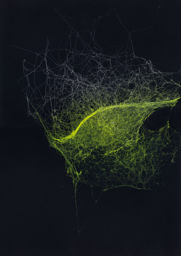
The first surprise was Sandra Selig's spider webs (image at left). Sorry, I don't know the name of the pieces — they didn't yet have a plaque. These are beautiful works, the kind of craft and aesthetics that makes me sit up and pay attention in a gallery. I was a little disappointed they were hung so high, they would reward detailed inspection. From a distance the webs appear to be interstellar clouds and have a liquidity about them that is resolved at close range into an infinity of fine thread. The luminous colours with which they are sprayed and the black background suggests that the artist too noted the potential vastness of these structures. "To see a world in a grain of sand... and all that Blakesque philosophy". Trite but true. A grey web on black has an elegance about it that the coloured forms lack. The sheen emerges instead from the varied density of the threads and the angle of the reflected light. All the same, these are lovely!

The similarity of patterns at multiple scales is a source of wonder for many scientists and artists. To see a spider's web as a colossal structure and an interstellar cloud as a tiny pattern in a lens is to muddle the usual perspective. A spider's web is an impenetrable, deadly thicket, a home, a nuisance that makes one's heart jump as it grabs at face and hair in the dark. This multi-level, visceral aspect of the thread is well captured in Selig's frames.

I'd never seen a decent print of Peter Dombrovskis' Morning Mist, Rock Island Bend, Franklin River, Tasmania (1979)... until now. This iconic image mobilised Australians as far away as Darwin to give a damn about a dam in Tasmania. It lifted the Australian conservation movement's impact up a notch and received global attention in some quarters. I place this image's cultural significance alongside the shot of blue Earth against the enormity of space. Both images reveal a world that was hidden. In each we see something worthy of protection.

The Franklin is an unseen place. Spectacular wilderness that is anything but mundane. For some, just the thought that places like this exist is necessary. Without them the world is somehow impoverished, albeit in a way that is often poorly articulated by those who have never experienced wilderness directly. (There I go complaining again about how others don't understand things as well as I do. I must break this irritating habit!) In Dombrovskis' image the river is wild, powerful and primal. This water is not just "The Franklin", it is all wild rivers, even all wilderness and this idea must be preserved. "No Dams", as a young high-school student this was (I think) the second time environmental issues appeared on my radar. The first was an effort to, "Save the Whales". I cannot recall any specific iconic image, only a pin badge I somehow acquired for the cause and non-specific footage of whales being slaughtered. Morning Mist is no 20 cent pin badge. It is the kind of accessible spectacle that hangs as well on a gallery wall, a board-room alcove, or as a poster in a politically-aware share house.

The Earth from space is in many ways the counterpoint to the Franklin. It is the everyday Earth. The planet on which we live. But its bounds are rendered explicitly. Its fragility and above all its uniqueness, dominate the image. Not its strength. The Earth is not a symbol for all planets nor is it a concept, it is just Our One Earth. On that globe all of humanity lives. All of history, all art and love and war. All the ecosystems of which we are a part share this tiny bubble in the enormity of the universe. Unlike the Franklin, the Earth is tiny, meek and mild. It is us, and we are alone. How pitiful, how insignificant are our battles. And yet, how vital it is that we fight them — from down here, the spider's web is a galaxy and we are flies trapped in it. We cannot escape to view our Earth from afar.

There's one more image (actually cinema footage) that immediately sprang to mind when I started considering Morning Mist. That's the footage of the last Thylacine pacing its cage in the Hobart Zoo (1930s). I've written about this footage before. A desperate animal, impatient, captive, the only thing certain is its death and the extinction of its kind. This sums up our colonisation of Australia, the way we treated its inhabitants and the way we continue to disrupt the ecosystems that have evolved here. We have a lot to be Sorry about.

Also in The Ecologies Project was a wall-sized video projection of an open-cut mine shot from its floor. Trucks and diggers shunted rock around a whitened, dusty landscape. The pale powder had been spread around the gallery and a rather flimsy looking white sculpture reminiscent of a drill or over-head pump had been erected here also. This work troubled me somewhat. I think the idea has potential but it fell a bit flat on first viewing. The video lacked punch, the machines lacked energy, the footage was bleached and pale, perhaps to convey the dusty greyness of the mine, perhaps the projector was just not up to the task. The sculpture looked cheap and impotent beside the seductive moving imagery. Was this deliberate?

Whilst there were several works in the exhibition I really thought were weak, this wasn't one of them. I just haven't worked out what I saw in it that kept me watching. I suspect that I have become so numbed by Hollywood's spectacular visual feats that video-art needs to pack a super-human punch to reach me or to take a completely different tack. At least the work wasn't a one-line gag!

The bleak minescape was certainly "interesting" but the video did not convey the awesome size of the site, nor the equipment, nor the immensity of the damage the mine symbolises. I think The Eden Project's breath-taking and theatrical approach is far more thought-provoking (The Eden Project was built in an old open-cut mine.) The immensity of the Grand Canyon is far more awe-inspiring. This work needs to do more than depict something that is better experienced first hand. Morning Mist succeeds where this fails because the photograph romanticises the wilderness. It takes the hard work, the biting cold, the mud and fierce rapids out of the river and leaves us with a symbol upon which to hang an imaginary wilderness. The mine footage takes all of the dust and noise out of the open-sore in the Earth, but I feel it leaves us with nothing and for this reason perhaps it failed to arrest me, despite my hope that it would.

I will revisit the gallery and see if I change my mind!

Wednesday, September 17, 2008

graffiti for butterflies - elliott malkin

BLDGBLOG has a link to Graffiti for Butterflies, a project that uses sunscreen and paint to post signs on walls for migrating Monarch butterflies. It's certainly out there! Why not just plant more Milkweed? Well, he did that too. I wonder if the signs painted in sunscreen are recognisable to a butterfly. It should be pretty easy to set up a controlled test to see their effect. I hope the butterflies don't come to a sticky end. At least they won't get sunburnt.

Signs that say "No Dogs on the Velodrome" in dog language would be really handy. Painting the city's statues with "No Pigeons" in pigeon-visible text would be another good application for this idea. Maybe we could protect Australia's borders from alien species in a similar way. OK, now I am being silly. The butterfly idea was cute and well-meaning. I should not be facetious. I have no idea though how you could present useful data to a butterfly or just about any other species. Route info.? This is beyond the comprehension of most taxi drivers.

Friday, September 12, 2008

space invaders - the new gargoyles

The Roman ruins of Pompeii and Herculaneum sat with their fantastic mosaics under ash and rubble since 79 AD until they once again saw the light of day and the tourists descended. I am particularly fond of the minotaur in the maze at Conimbriga in Portugal also.

Its amusing to think that some of the mini-murals by Parisian street artist known as Invader may be around as long. When I first saw these in the streets of Paris I wasn't sure who had made them. They cropped up in so many places, sometimes obviously threatening you from prominent architectural facades, sometimes peeping down at you from a more hidden recess. I thought perhaps they were a group-art project or a new kind of tagging.

Well, now I know that the hundreds of invaders are the work of one person. This website has maps and photographs of the invasion of Paris. The official website also has details of the international invasion including an image of the arrival of a scout in Melbourne!

Part of the appeal of these works for me is that they are scattered around the city, that with a map you can find them, and that they are aesthetically to my taste. I suppose they are like contemporary gargoyles. As an avid gargoyle spotter I can only say this invasion is very cute!

Wednesday, September 10, 2008

multiple, multiples - chris jordan


Chris Jordan builds images from tiny elements that are themselves the item whose consumption he wishes to visualise. For instance, he draws attention to the US statistics on : plastic cups used and discarded by airlines, paper coffee cups, Energizer batteries, breast enhancement surgery, deaths caused by smoking, prisoners incarcerated etc. His art becomes a bit monotonous unfortunately. The point is that these numbers are huge and according to his presentation, he would like the US society (others too I expect) to look at itself and understand the impact of individual decisions and lifestyles. After viewing two or three of his works I am no longer engaged. Yes, the numbers are staggering. The art needs to be more than a pretty visualisation of daunting numbers to keep me interested.

Thursday, September 4, 2008

spatial ecosystems - Motomichi Nakamura

The images of Motomichi Nakamura like that at left feel like "spatial ecosystems". The organisms' forms are constrained by their neighbours' and the space as a whole. Where there is a niche an organism has become especially suited to it.

The only spatial aspect I feel to be missing is hierarchy. I.e. the images would be more ecosystem-like if some organism's bodies were rendered inside the bodies of others. I don't think this is one of the artist's concerns though :-)

colour and pain II

As I flicked through some travel photos from a few years ago, I note that I inadvertently photographed Bartholomew, a Christian saint who was flayed alive, as illustrated in vibrant colour by Michelangelo on the wall of the Sistine Chapel. Bartholomew is pictured holding his own skin as he ascends to heaven. He doesn't look as horrific as one might expect for a person just flayed. In fact he has regrown his original skin and carries his old one like a winter coat. One weird thing about the image is that Michelangelo apparently painted his self-portrait into the flayed skin as some kind of protest about the way he and his art were being treated by the priesthood... no nude saints on the walls of the Sistine Chapel thanks! What did the priests think of all of the ancient Roman statues I wonder?

This ghastly event (flaying I mean, not nudity or painting) links neatly with a Ted.com talk by Steven Pinker on violence and another by Daniel Goleman on compassion. Firstly, Pinker gives a reasonable argument that even taking into account the current conflicts and violence, overall the world is now a much less violent place than it has been in the past. For instance, flaying might still occur in some countries, but this is no longer the norm. Seldom are people executed or de-limbed for small misdemeanors as they might have been in the past. In some countries you can still suffer torture and internment for speaking out against the government. But we in the developed world are made aware of this often by the media. It sticks in our minds. We notice and sometimes complain.

Goleman explains his belief that empathy and compassion are intrinsic parts of being human. We are hard-wired this way. Sometimes though we are so concerned with our own circumstances, even if it is just that we are running late for an appointment, that we forget to switch on empathy for those who might be right in front of us. He feels that if we allow ourselves to be this self-centered we are not being as human as we might.

So, it sounds like I am preaching a sermon here. But all of this investigation led me via a strange route to discover a website with photographs of an execution by quartering. The site shows a long series of black and white photographs that were shot in Beijing, 1905 and distributed as picture postcards! Can you believe it? The first time I discovered the site I could not bring myself to look in detail at the images or captions. I have just done so. The fact that the images are black and white makes the whole scene more macabre and less like the anatomy texts I have been perusing lately. It takes on an unreal quality about it until one flicks the "empathy" switch. With this engaged I feel sick to the stomach. I won't link to the site from here. I can only guess that the hoards of onlookers at the execution must have had their empathy firmly planted at the back of their brains. These images are no "Bartholomew on his way to heaven". Their stark reality would really have been something for the priesthood to get upset about. Perhaps a few less religious wars, inquisitions and torture sessions might have benefited the world.

The surgeon cuts and repairs. The torturer cuts and destroys.

Wednesday, September 3, 2008

the flexipede

1967, 2 mins, film: 16mm, colour, sound.

This image is from the computer animation The Flexipede by Tony Pritchett. The film was apparently the first computer animation produced in Britain. It was made with the help of the University of London's Atlas computer using its programming language Autocode. Flexipede's soundtrack was produced using foley techniques. The film was first shown publicly at the Cybernetic Serendipity exhibition (1968).

Friday, August 29, 2008

The Ecologies Project - Monash Uni. Museum of Art

17 September 2008 - 22 November 2008

Opening function: Saturday 20 September 2008, 2pm
Curators: Geraldine Barlow and Dr Kyla McFarlane

Pre-opening curator's talk
Saturday 20 September at 1.30pm

Opening function
Saturday 20 September at 2.00pm
Monash University Museum of Art, Clayton Campus
With opening remarks at 2:45pm
by Professorial Fellow John Thwaites, Chairman of the Monash Sustainability Institute, and Former Deputy Victorian Premier and Minister for Environment, Water and Climate Change

What is this project that we are now undertaking, as we globally seek a new balance with the ecological systems that sustain us?

Will endgame, apocalyptic visions drive change, or can our wonder in the natural world inspire the creation of a brighter future?

Artists have long drawn inspiration from nature, as well as being advocates for a sustainable relationship between humanity and the environment. Now that a need for change has become broadly accepted, what role for art? Even with this accepted impetus to action, the particular paths we might take are unclear. It is an exciting and unsettling time as we sit between the darkest and most hopeful of futures. We must grapple with a myriad of abstract and interconnected systems, economic, environmental, social and philosophical. At this moment in time, art offers a lens through which we can examine the world as well as a kind of metaphorical thinking that can sharpen our perception of the relation between these complex parts and their impact on a dynamic whole. The Ecologies Project includes work by 40 artists exploring issues of sustainability, climate change and the idea of ecology as both form and metaphor.

LAURENCE ABERHART | LAUREN BERKOWITZ | CHRIS BOND | ANGELA BRENNAN | PAUL BUWANG BUWANG | JANET BURCHILL AND JENNIFER McCAMLEY | JOYCE CAMPBELL | MIKALA DWYER | MICHAEL CORRIDORE | PETER DOMBROVSKIS | BRODIE ELLIS | ANNA EPHRAIM | GALI YALKARRIWUY GURRUWIWI | ANDREW HAZEWINKEL | SUSAN JACOBS | ASH KEATING | NICK MANGAN | DHUWARRWARR MARIKA | MANDY MARTIN | VERA MÖLLER | JAMES MORRISON | ANNE NOBLE | HENRY NUPURRA | RAQUEL ORMELLA | FIONA PARDINGTON | LUKE PITHER | ADAM PYETT | STUART RINGHOLT | EWEN ROSS | SANDRA SELIG | ANDREW SINCLAIR | EILEEN YARITJA STEVENS | LISA STEWART | RICKY SWALLOW | CHRISTIAN THOMPSON | MICHELLE USSHER | ROHAN WEALLEANS | ROY WIGGAN | JOHN WOLSELEY