Showing posts with label data visualisation. Show all posts

Tuesday, March 9, 2010

cataclysm

A sunny afternoon was smothered by a billowing black blanket this last Saturday. What a downpour ensued! Massive hailstones punched holes in cars, windows, roofs and smashed vegetable gardens across Melbourne. The wind drove torrents across the velodrome in pursuit of those who only seconds before had been dashing for the line... a sprint that was called to a halt as the canvas gazebo, uprooted by a violent gust, was sent collapsing across the finishing straight. Riders scampered clumsly from the track through the gate, shouldering their bikes and clambering in cleats for shelter.

This morning's ride down the bike path in the aftermath was something of an obstacle course. The icy canonballs have of course melted. Still the evidence of their visit is everywhere. Trees appear to have been whipped through a blender. Roads, gutters and paths are covered in a shredded litter of leaves and twigs. Drifts of mud set traps for narrow tyres and dam puddles of black. Riding through them creates artistic café latte patterns as the mud is stirred... and destroys them as the rear wheel follows the front. My bicycle needs a wash!

All this gave me cause to check the maps available on the Bureau of Meteorology website. Here I discovered a map type I hadn't seen previously (see above). This map indicates the percentage of the mean rainfall that has fallen in a particular month. Pretty good! It clearly depicts the areas of above and below mean rainfall. I am very pleased to see they didn't just run through the usual (ugly) range of hues available whilst maintaining a constant (usually full) saturation.

Wednesday, September 24, 2008

visual musical score - ANS synthesiser

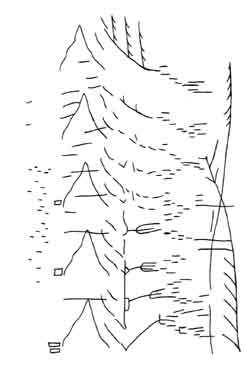
Here's a visual score for the ANS Synthesiser. Its by composer / audio engineer Stanislav Kreichi who discusses the synth and its development online. This visually appealing score reminds me of a sketch from an ecology text book. It seems to depict mountains, wind, rain and perhaps alpine vegetation. Perhaps this idea inspired Metasynth in which a very similar score of peaks, troughs and pulses can be composed visually for synthesis. I've just inverted this image and loaded it into Metasynth to hear it. Well, it sounds like it looks. In the 60s I bet that was really something! I'm not sure of the original scaling in the temporal dimension but I've played around with the mappings to have it play out over 30 seconds. Its great that a score from the 1960s can still be played on software made a few years ago.

Wednesday, September 17, 2008

graffiti for butterflies - elliott malkin

BLDGBLOG has a link to Graffiti for Butterflies, a project that uses sunscreen and paint to post signs on walls for migrating Monarch butterflies. It's certainly out there! Why not just plant more Milkweed? Well, he did that too. I wonder if the signs painted in sunscreen are recognisable to a butterfly. It should be pretty easy to set up a controlled test to see their effect. I hope the butterflies don't come to a sticky end. At least they won't get sunburnt.

Signs that say "No Dogs on the Velodrome" in dog language would be really handy. Painting the city's statues with "No Pigeons" in pigeon-visible text would be another good application for this idea. Maybe we could protect Australia's borders from alien species in a similar way. OK, now I am being silly. The butterfly idea was cute and well-meaning. I should not be facetious. I have no idea though how you could present useful data to a butterfly or just about any other species. Route info.? This is beyond the comprehension of most taxi drivers.

Wednesday, September 10, 2008

multiple, multiples - chris jordan


Chris Jordan builds images from tiny elements that are themselves the item whose consumption he wishes to visualise. For instance, he draws attention to the US statistics on : plastic cups used and discarded by airlines, paper coffee cups, Energizer batteries, breast enhancement surgery, deaths caused by smoking, prisoners incarcerated etc. His art becomes a bit monotonous unfortunately. The point is that these numbers are huge and according to his presentation, he would like the US society (others too I expect) to look at itself and understand the impact of individual decisions and lifestyles. After viewing two or three of his works I am no longer engaged. Yes, the numbers are staggering. The art needs to be more than a pretty visualisation of daunting numbers to keep me interested.

Thursday, August 28, 2008

mind the gap: animated data

Hans Rosling, professor of global health at Sweden’s Karolinska Institute, gives an animated talk employing animated data on the TED website. In addition to the demonstration of his very cute data-visualisation software, Trendalyzer, the talk discusses the relationships between a nation's child mortality rates, GDP, family size and various other values. Some surprising (to me anyway) trends from the last 40 years of worldwide development are revealed. In particular, there does seem to be a global upturn in health as measured by these simple statistics. The spread of wealth seems to be flattening across the nations, and the health and wealth of the "developing world" is approaching that of the West. However when viewing statistics within each country, similar trends are not necessarily present, the divide between haves and have-nots remains.

More information on the software and associated projects is available from Rosling's not-for-profit organisation, Gapminder. A quick play reveals Australia is up there with Japan and Switzerland amongst the very top few nations for life expectancy. As individuals we don't quite have the material wealth of some other countries (e.g. Luxembourg!), but we seem to live a couple of years longer. We also emit a lot of CO2. I wonder if data is available to compare the number of stadia, museums and art galleries, theatres and concert halls per capita between countries. Just curious.

Saturday, August 23, 2008

athletics, Muybridge and the red queen

Shot type 1: Its over 100 years since Muybridge's death and I find myself glued to the television to appreciate an idea that originated with him. The Olympic Games have been two weeks of the most beautiful pictures of human physiology I have ever seen. My favourite shot is certainly the slow motion tracking camera that follows alongside a sprint or gymnastic tumble.
I first consciously appreciated this shot as the final sprint in the Tour de France exploded along the Champs Elysées a few years ago. The lens does not distort the perspective as it would when using a distant telephoto. The angle remains fixed. The background tears past at a terrifying rate, the cyclists are trapped in the frame like the Red Queen, legs ablaze, faces straining, backs arched before a final throw for the line. And the whole thing can be repeated at a fraction of race pace so that you can take it all in: muscles ripple, sweat collects on noses and jaws before gracefully lifting from the grimacing face to glide away and off-screen.
The same shot applied to athletics, especially the 100m sprint, reveals the wealth of detail Muybridge captured. The form of a top class runner is a gorgeous sight that can best be appreciated in this slow motion tracking shot. The technique allows the repetition of the cycle to be appreciated. For just short of fifty paces the best runners maintain a fluidity that belies the effort it requires. In less than 10 seconds the race is all over, the medals are decided, the athletes are ecstatic and bounce around, or they are shattered and collapse in tears on the track. Years of effort to produce 10 seconds of glorious physiological poetry. Thanks, your effort is appreciated... especially by the airlines, fast-food chains. vehicle manufacturers and banks whose advertisements I had to endure... but also by the millions of other crazy people like me who tuned in to admire technology's view of the body in motion.

Shot type 2: The photo-finish is also a fascinating piece of work. In this, slices of the athletes as they cross the line are compiled into a single image with a timing scale marked along the image's edge. Lines placed on the image at the point where an athlete's chest (or front bicycle wheel) first touch the line may then be read off the timing scale to determine their time. The distorted forms of the athletes look less than elegant, but the image is a great way to reveal a winner.

Saturday, August 9, 2008

wilderness: the edge of the map is in the middle

I've just read Shaun Tan's latest book, Tales From Outer Suburbia. Lovely! It is so strongly reminiscent of suburban Melbourne I can't help but feel Shaun was brought up down the street from me. One of my favourite stories tells of two young boys off to seek the end of the street-directory. What is beyond the edge of the map? After travelling for hours into outer, outer suburbia, past countless shopping plazas and endless suburban streets, as the sun sets they find out. I won't say what they find out, you can read the story yourself.

The edge of the map is a fascinating concept. Behind the cricket nets, the Antarctic, a secret passage, the ocean's depths. Maps don't reach everywhere. Has Google ruined this? Of course I am amazed at the technology that allows me to zoom in to satellite images from a computer anywhere in the world, or to trace a path I have followed through the wilderness or the alps. I am slightly unsettled by the view of suburban streets Google offers. It seems like every place is Google-able, even my front door and private (!?) back garden.

On more careful reflection, even Google stops somewhere. For instance, where are the web pages that a Google search doesn't find? When I search for a document using an English keyword millions of non-English pages are ignored. They lie in a document-wilderness, a hidden place or faraway space. This is true of all literature, all communication, and all ways of thinking that I am unable to interpret. All this information buzzes around my head but I am blind to it.

Whilst it may show the South Coast track in Tassie from above, Google is blind to the muddy creek crossings, the bountiful waterfalls, the massive towering gums. Google misses the subterranean drains, the hollow trees. In fact, Google Earth misses so much of the Earth. If its not on the map is it there? What is it? I'd say this is wilderness.

Wilderness then is all around us, especially under our noses. It is right in the middle of the maps we view. Wilderness lies in between things on the map, as well as off its edges. An evocative book by Robert MacFarlane, The Wild Places, travels the UK in search of local wilderness. These are places that have fallen off the daily map. As people become dependent on different maps, the places unmapped become wilderness left to discover. Wilderness lies between your home and your workplace... when was the last time you stopped your car, got out, and walked around out there? I bet you travel through this wilderness every day, never stopping. Can't see wilderness? Just take a look at the end of your street.

Afterthought: If something isn't mapped but it needs looking after, who will do so? Who will look out for the unclassified organisms? The unmapped forests? Will they die a lonely, quiet death under the developer's bulldozer?

Wednesday, August 6, 2008

library return-date stamps

I lament the loss of the sheets of paper glued into the back of library books on which the librarian would batter a date stamp. They told of the history of the very book that was snuggled into my hand. Every time I borrowed a new book I felt like I was playing a part in its life, as it was in mine.
No longer can I tell whether I have discovered a rarely read gem or a well worn train of thought. Barcodes have a lot to answer for when it comes to data aesthetics. The different coloured stamp blocks that sometimes stamped well, and sometimes so faintly they could hardly be discerned added character to a book like the lines on a mountaineer's face or the scars on a cyclist's limbs.